

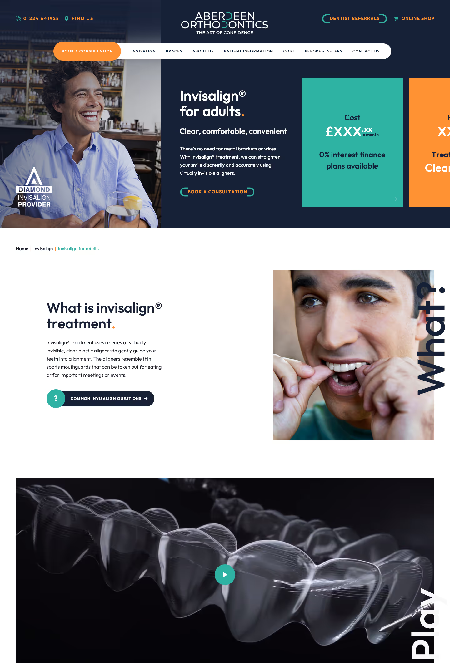
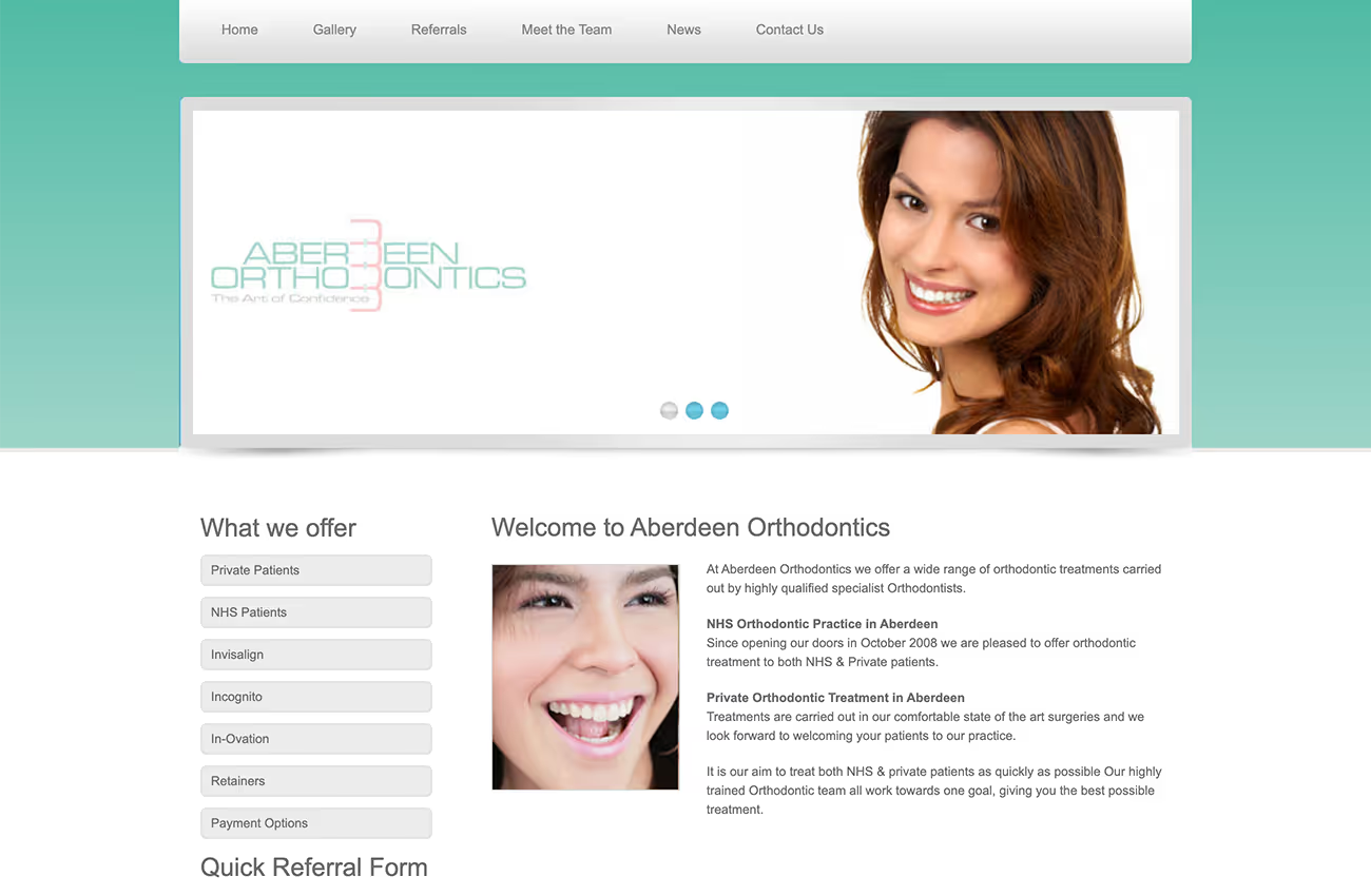
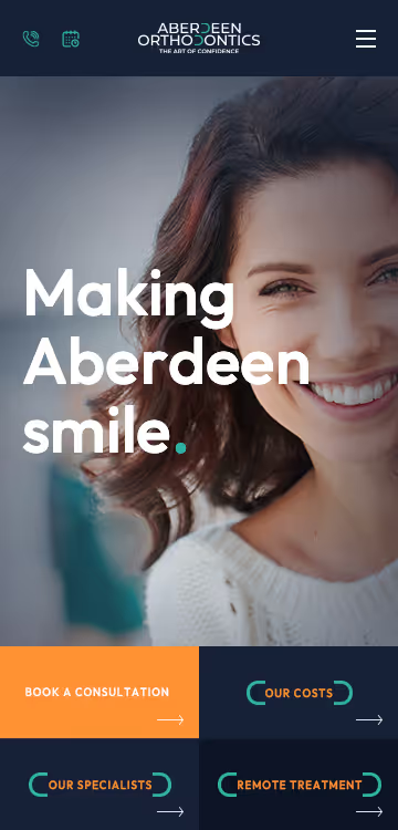
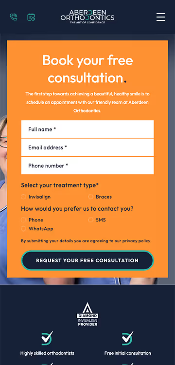
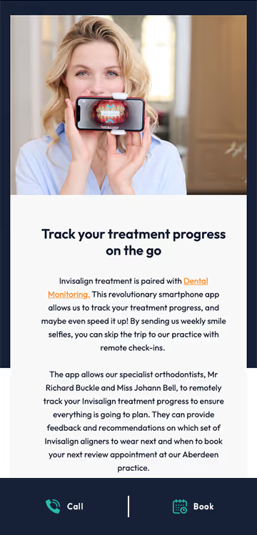
Aberdeen Orthodontics approached us for a total redesign of their website and logo to better represent their focus on Invisalign treatments. They needed a clean, modern, and user-friendly design that was mobile-ready. By focusing on essential elements like easy navigation, bold call-to-actions (CTAs), and images of smiling faces instead of close-ups of teeth, we aimed to improve the user experience and lift site conversions. Our goal was to ensure the new look appealed to their demographic and enhanced return on investment.
Logo design
Web design
Web development
Wireframes
We developed a professional, conversion-optimised website with a fresh colour palette. The design features clean lines and ample white space for a minimalist look. We organised the navigation into primary and secondary sections for clarity, included interactive content sections, and used parallax images to engage visitors. Fonts, colours, and shapes were selected to create a welcoming feel, reflecting the in-practice experience.
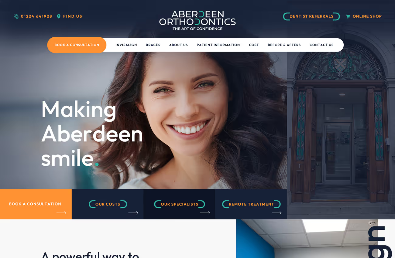
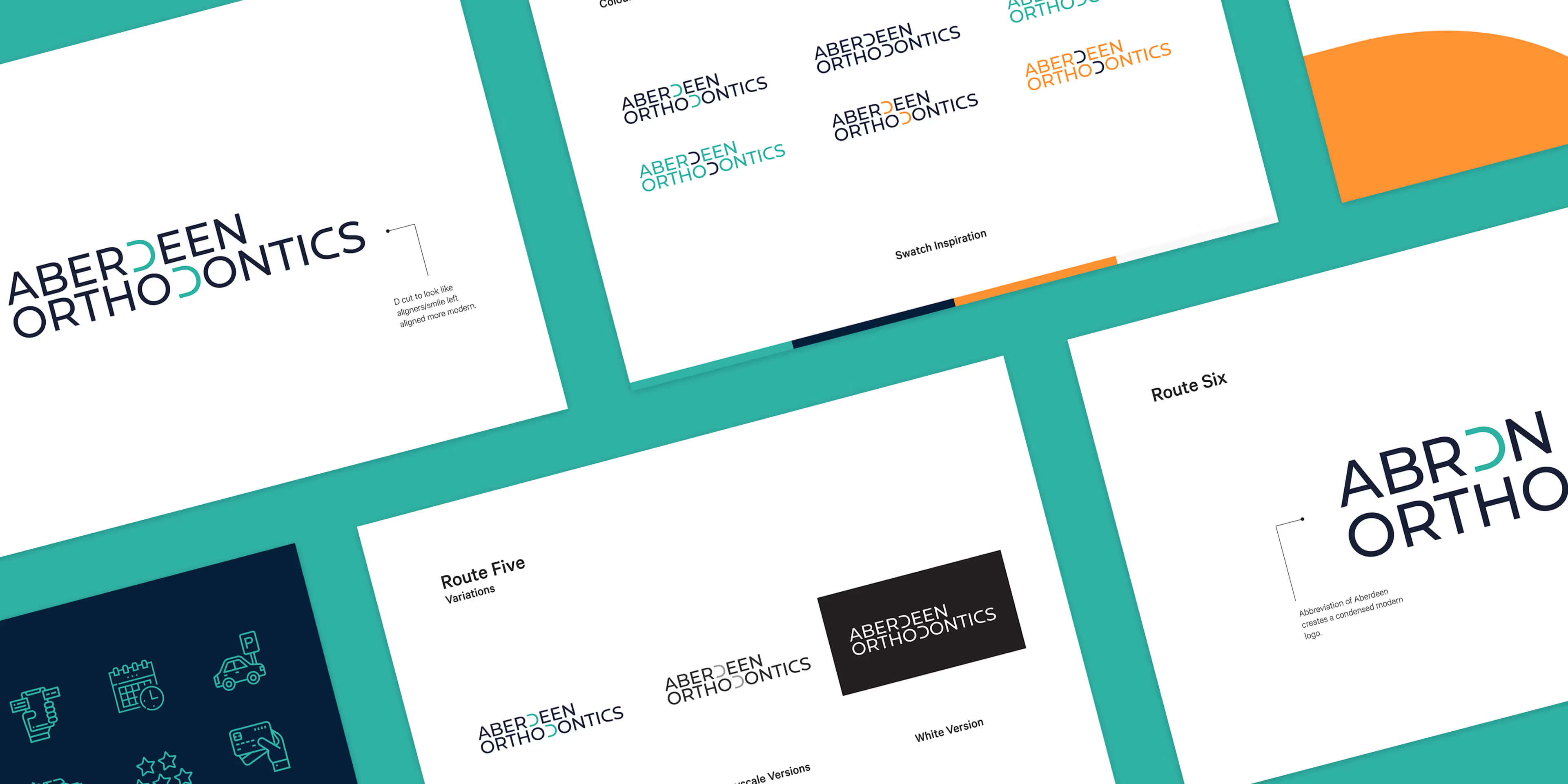
Aberdeen Orthodontics sought a modern refinement of their existing logo, focusing on evolving it rather than a complete redesign. The two "D"s in the logo were crafted to resemble aligners or smiles, symbolising the clinic's orthodontic services. This subtle yet meaningful update maintained the brand’s recognisability while giving it a fresh, contemporary feel.


Barncroft, Abberton Road, Bishampton, Worcestershire, WR10 2LU.


