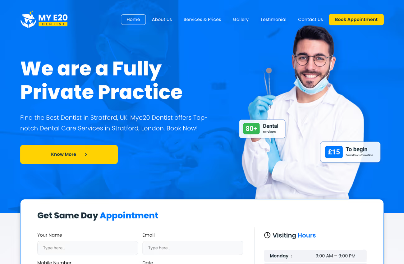
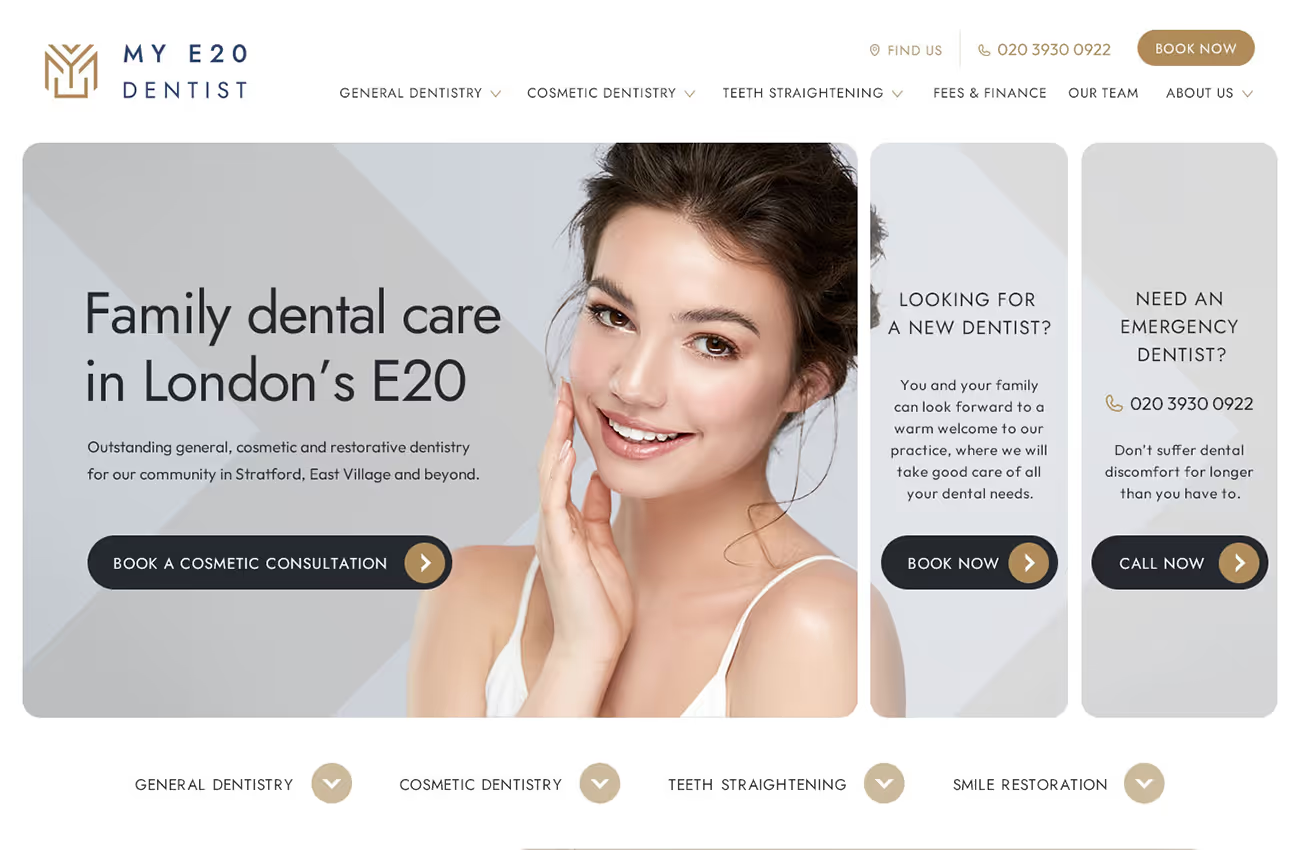
Our brief was to create a modern, user-friendly website for My E20 Dentist that reflects the practice's welcoming and professional atmosphere. We needed to ensure the site was visually appealing, easy to navigate, and clearly communicated the high-quality dental services offered. The design had to integrate the brand's colours, logo elements, and include expansive imagery of the practice and team to foster a sense of trust and approachability.
Logo design
Web design
Wireframes

Our solution features a bright, confident design with vibrant pops of colour and soft rounded corners to create a harmonious visual experience. We used a clean, minimalist layout inspired by the client's preferred websites, incorporating gold, dark grey, and blue from the logo. The chosen fonts enhance readability and maintain visual consistency. Expansive images of the practice and team, along with strategic stock photos, invite users to explore the site and feel welcomed.
My E20 Dentist required a modern, professional logo that reflected their innovative, high-tech dental care. A geometric icon was created using the letters ‘M’, ‘Y’, and ‘E’ from the name. The angular design symbolises their advanced approach, while the gold and blue colours convey professionalism and sophistication, aligning with the practice’s ethos.


Barncroft, Abberton Road, Bishampton, Worcestershire, WR10 2LU.


