Our brief for Be Clear Orthodontics focused on creating a visually engaging website to attract and retain potential clients. We emphasised using dynamic transitions and interactive elements inspired by popular websites to enhance user experience and optimise lead conversion rates. Our goal was to develop a site that was both aesthetically pleasing and functional, catering to a diverse demographic interested in orthodontic services.
Logo design
Web design

We implemented a full-viewport scrolling design, integrating subtle yet impactful interactions to maintain user engagement and highlight key information. By incorporating video backgrounds, interactive buttons, and real-time social media feeds, we aimed to create a seamless user journey. This approach was chosen to increase return on investment by improving user experience and encouraging more online consultations and bookings.
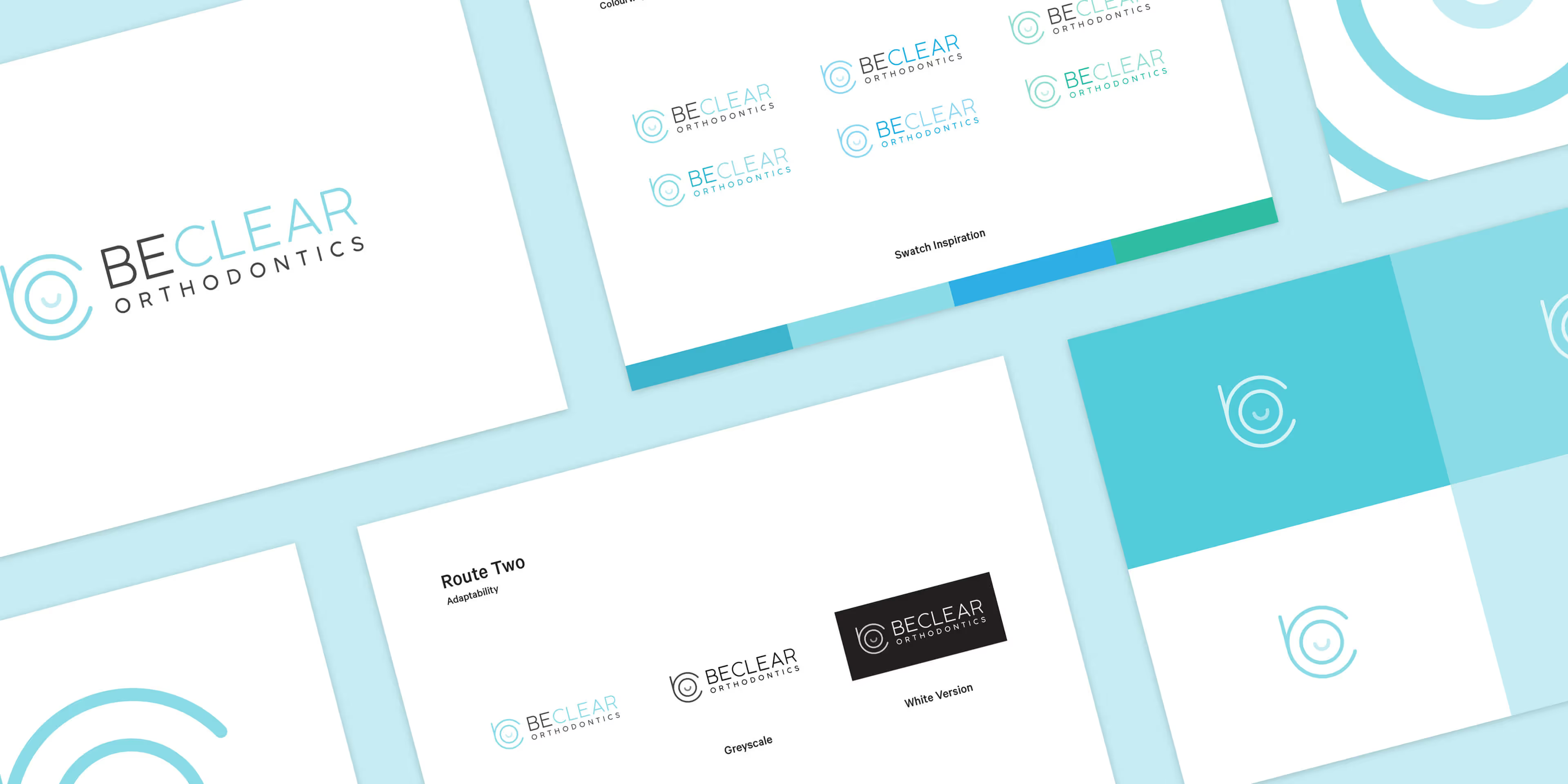
Be Clear Orthodontics requested a modern logo featuring a contemporary icon that subtly combines the practice's initials with a smile. The design uses sleek, clean typography and modern shades of blue, aligning with their existing brand identity. The result is a fresh, professional look that embodies the practice's clarity and care, while maintaining a friendly and approachable tone.


Barncroft, Abberton Road, Bishampton, Worcestershire, WR10 2LU.


