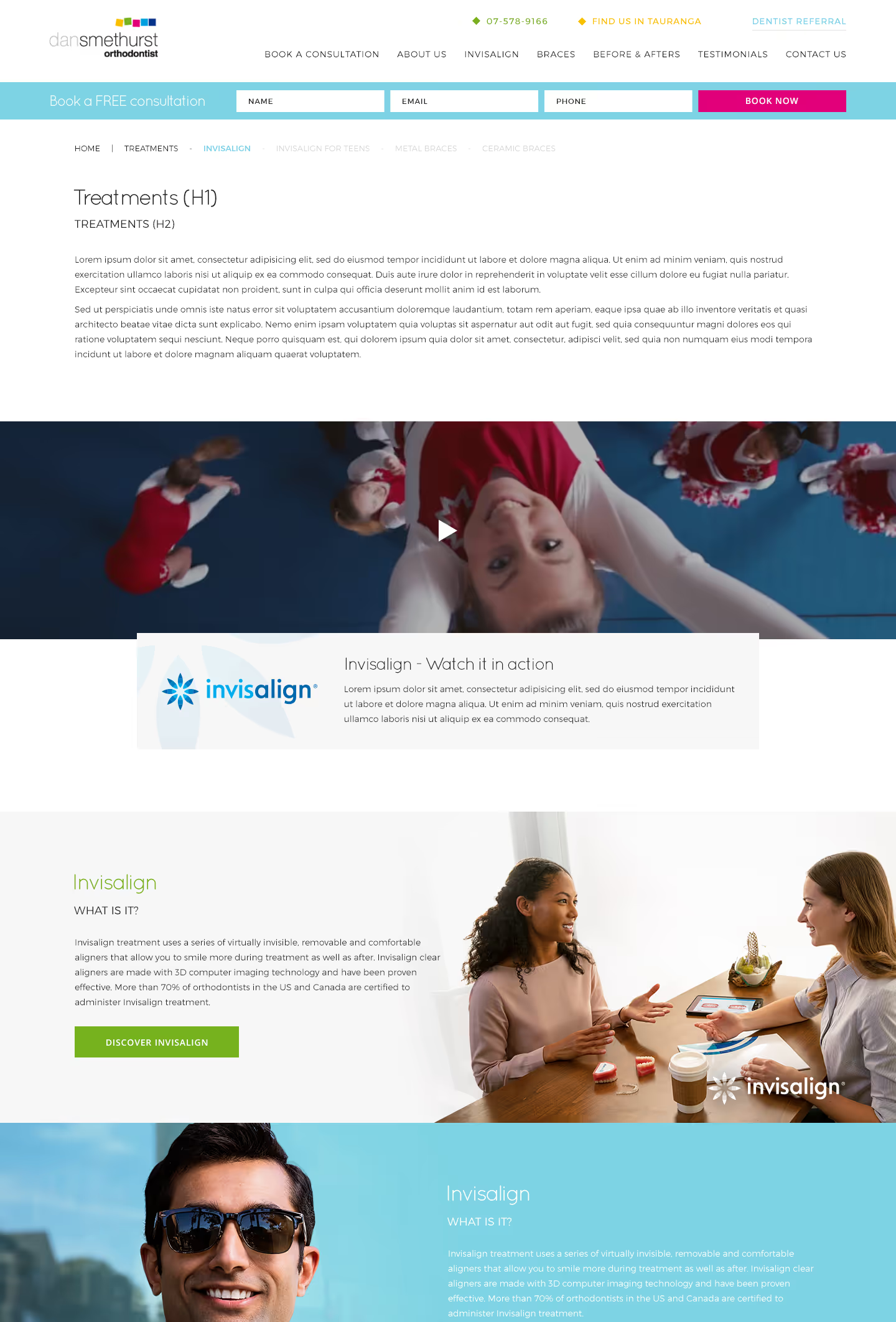
The brief for Dan Smethurst Orthodontics was to create a clean, uncluttered, and fresh website design. We were asked to develop a professional yet welcoming look that aligned with the existing logo colours. The design needed to be easy to navigate, visually appealing, and capable of highlighting key information effectively.
Logo design
Web design
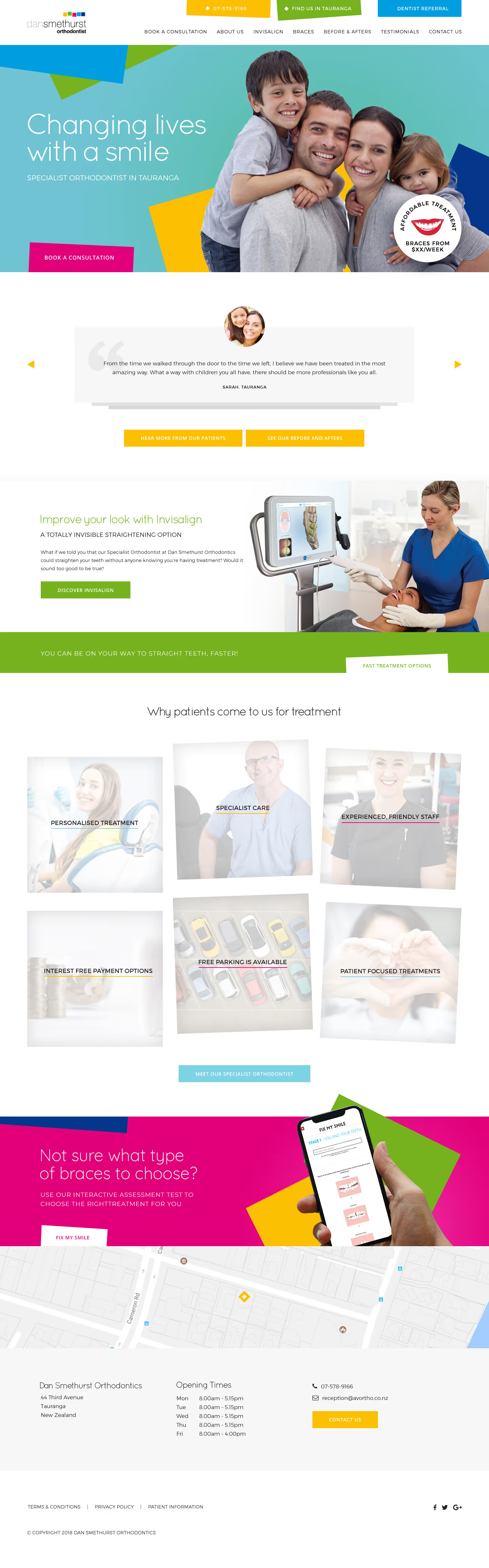

We developed a contemporary design using easily readable fonts for visual appeal. Key features include a testimonial carousel and a dynamic 'Why patients come to us' section that cycles through information to engage users. The footer has a simple map design for quick location reference. Adaptable sections for Invisalign ensure consistency with the main colour scheme. Overall, the design is clean, modern, and aligns well with the practice’s branding.


In 2018, the task was to adapt the existing Dan Smethurst Orthodontics logo to reflect a potential name change to Tauranga Orthodontics. The updated design had to maintain the established identity while incorporating the new regional focus. The outcome effectively balanced familiarity with a fresh local touch, ensuring continuity in brand recognition while aligning with the new name.


Barncroft, Abberton Road, Bishampton, Worcestershire, WR10 2LU.


