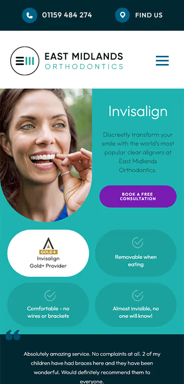
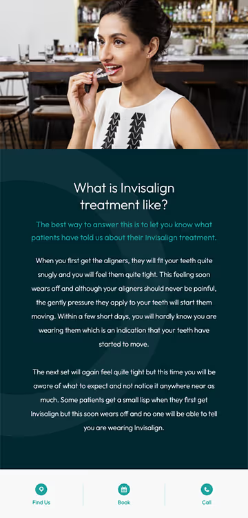
We were tasked with creating a fresh, contemporary website for East Midlands Orthodontics that radiates a fun and personable feel. The goal was to ensure the design reflected their brand values and appealed to a younger audience. The client admired elements from several other dental websites, wanting a blend of bright colours, modern aesthetics, and a strong identity unique to their practice.
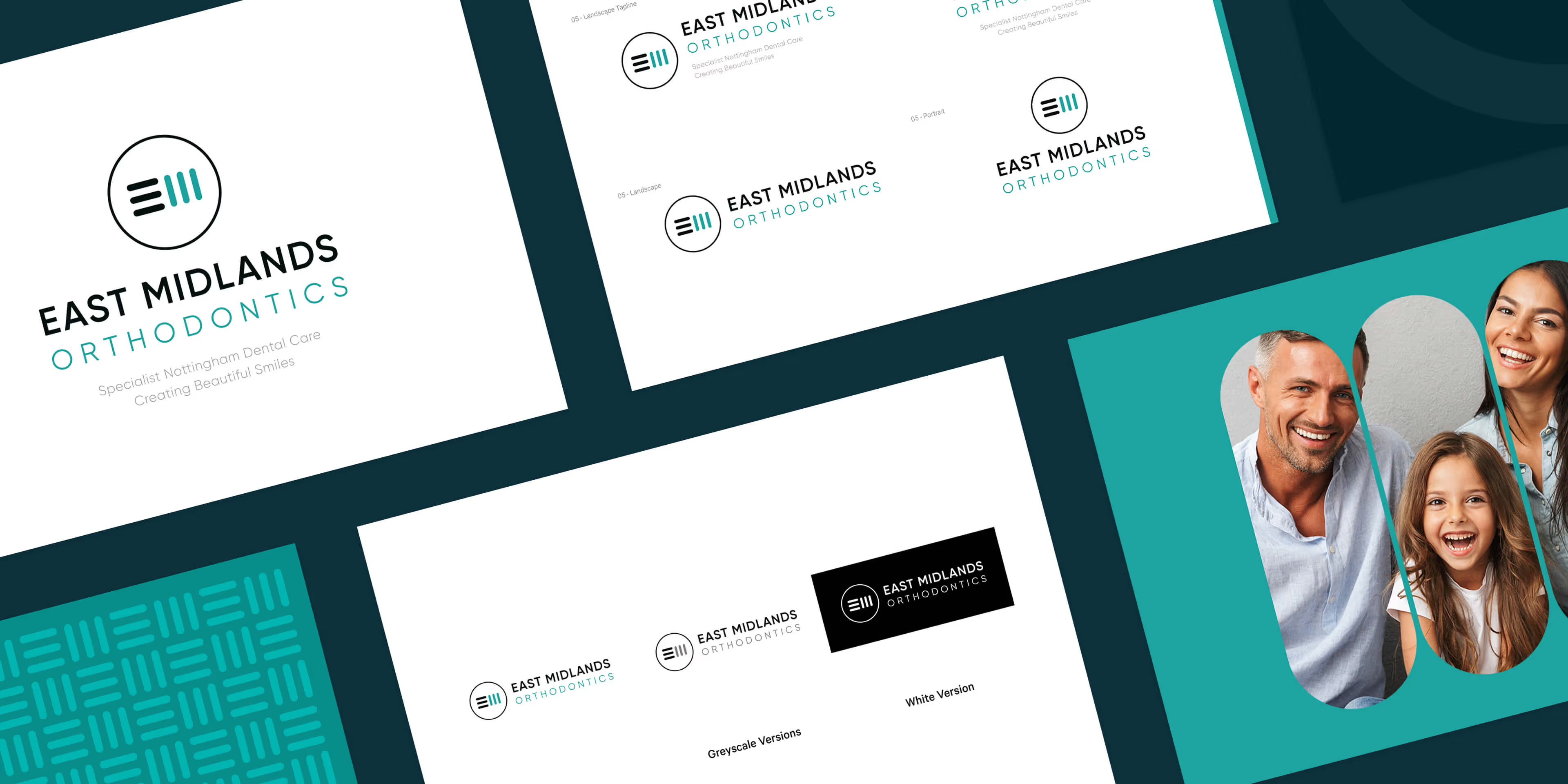
Logo design
Web design
Web development
Wireframes

Our solution involved a colour palette featuring mint green and purple accents, inspired by their branding and staff uniforms. We used highly readable, contemporary sans-serif fonts and incorporated pill-shaped image containers to give the site a distinctive look. The design also features harmonious colour tones, ample white space, and consistent branding elements, ensuring a clean, tech-focused aesthetic that resonates with their target audience.
East Midlands Orthodontics required a modern, clean logo that conveyed professionalism and trust. The design uses simplistic, contemporary shapes to represent the letters "E" and "M," framed within a circle to soften the edges and create a friendly tone. The teal and black colour palette highlights the practice's high-tech and knowledgeable approach, ensuring a professional yet approachable brand identity.


Barncroft, Abberton Road, Bishampton, Worcestershire, WR10 2LU.


