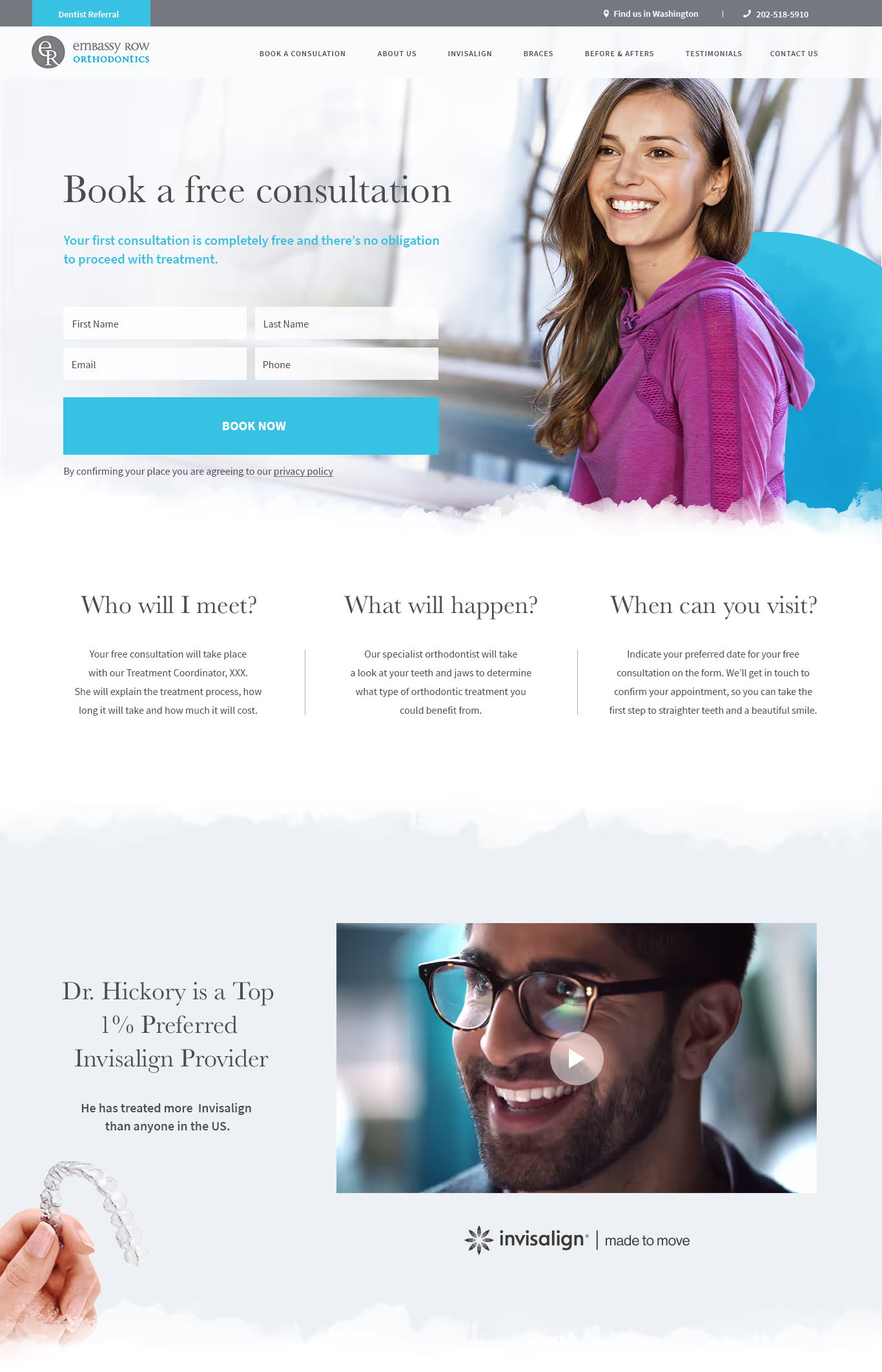
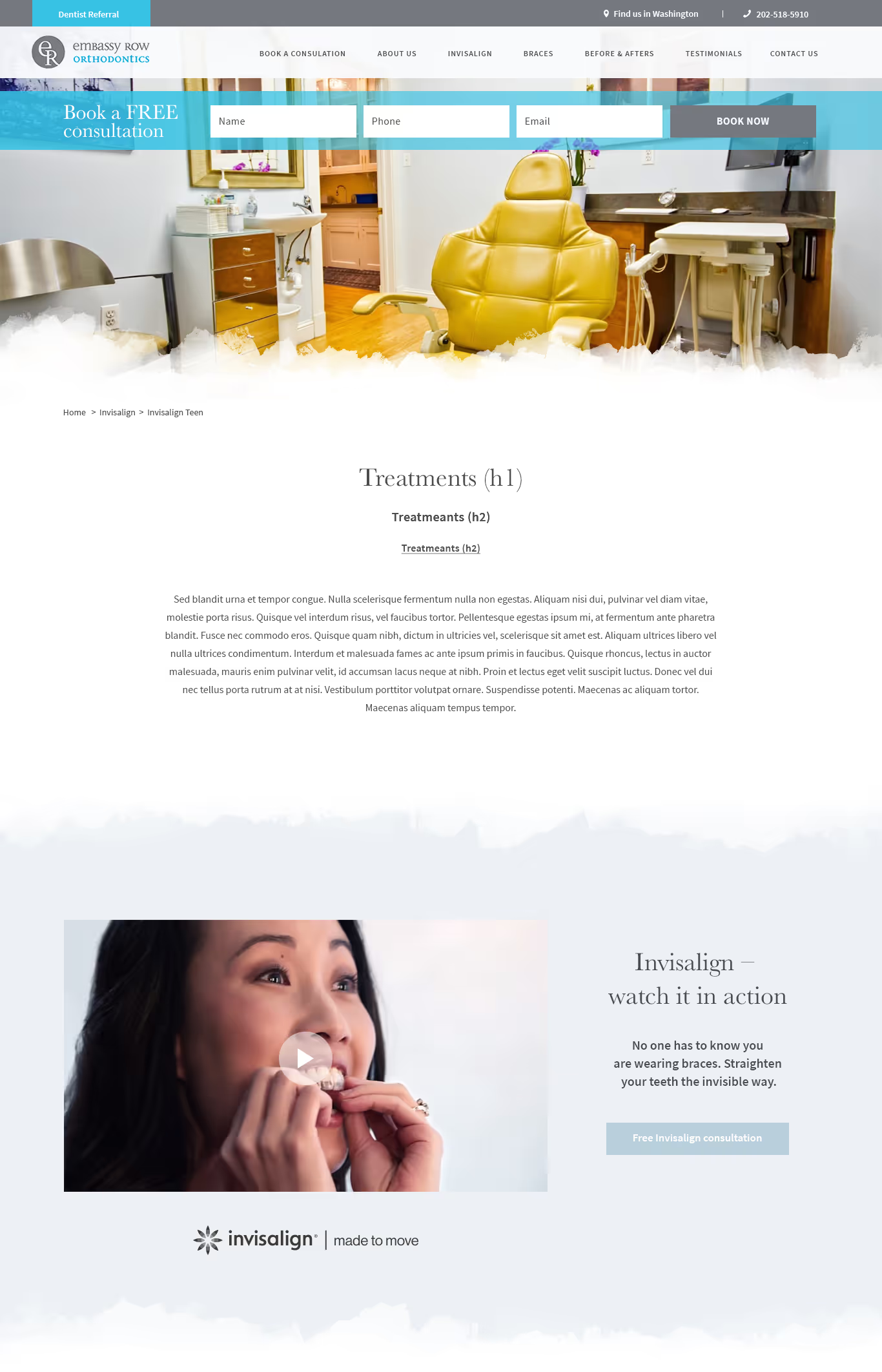
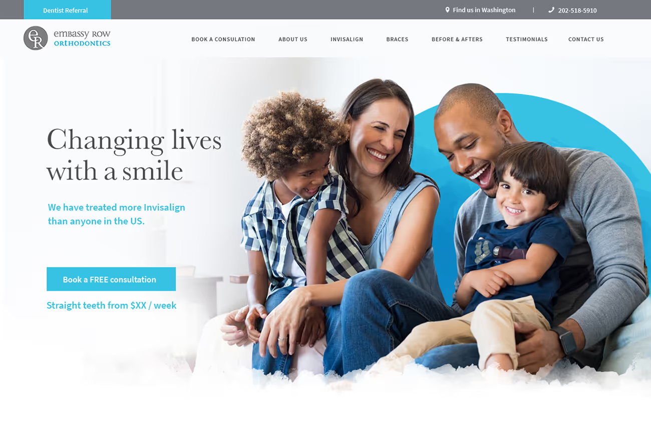
We aimed to create a calm, professional, yet engaging website for Embassy Row Orthodontics. The client desired a design that used soft, light shades, ample white space, and imagery cut-outs. The font choices needed to blend a timeless, professional look with a modern, minimal style, and the colour palette was to reflect the spa-like environment of their practice.
Web design
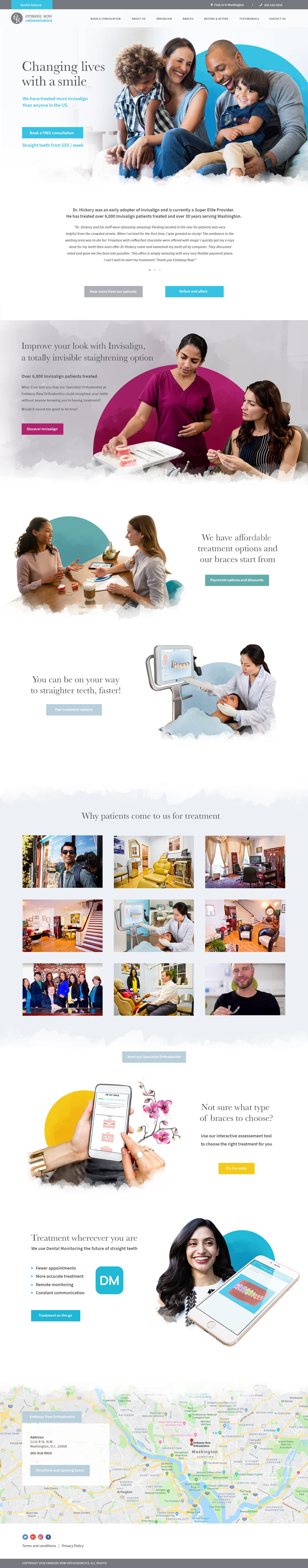

Our design features a mix of serif and sans serif fonts for a timeless yet minimal feel. The colour palette, inspired by the practice’s interiors, includes light blue, yellow, bright pink, teal, blue, and grey, creating a calm yet lively atmosphere. We used watercolour textures and ample white space to enhance the spa-like feel. Imagery was carefully selected to complement the colour scheme, ensuring a cohesive and inviting design.


Barncroft, Abberton Road, Bishampton, Worcestershire, WR10 2LU.


