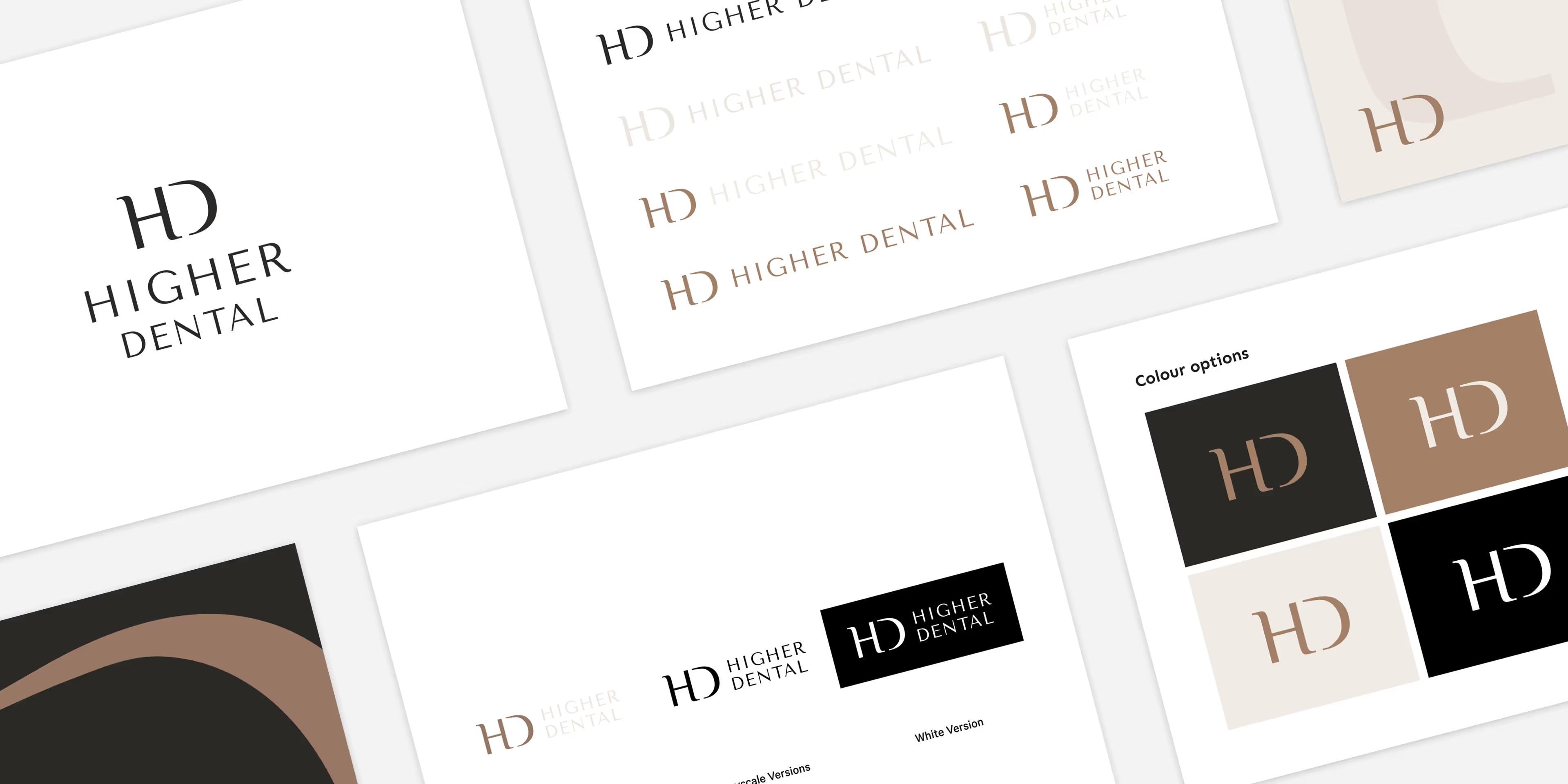
Higher Dental requested a clean, minimal logo design that would reflect their modern and professional practice. The brief called for a refined icon based on the initials ‘H’ and ‘D’, paired with an elegant, contemporary sans-serif font. The goal was to create a neutral yet inviting look, using a contemporary colour palette to convey trust and sophistication.
Logo design

The resulting design features a simple, well-balanced icon combining ‘H’ and ‘D’ with soft curves and clean lines. A complementary sans-serif font enhances the minimal, modern feel. The neutral colour scheme, consisting of soft browns and blacks, adds a professional and approachable tone, perfect for a dental practice that aims for both warmth and professionalism.


Barncroft, Abberton Road, Bishampton, Worcestershire, WR10 2LU.


