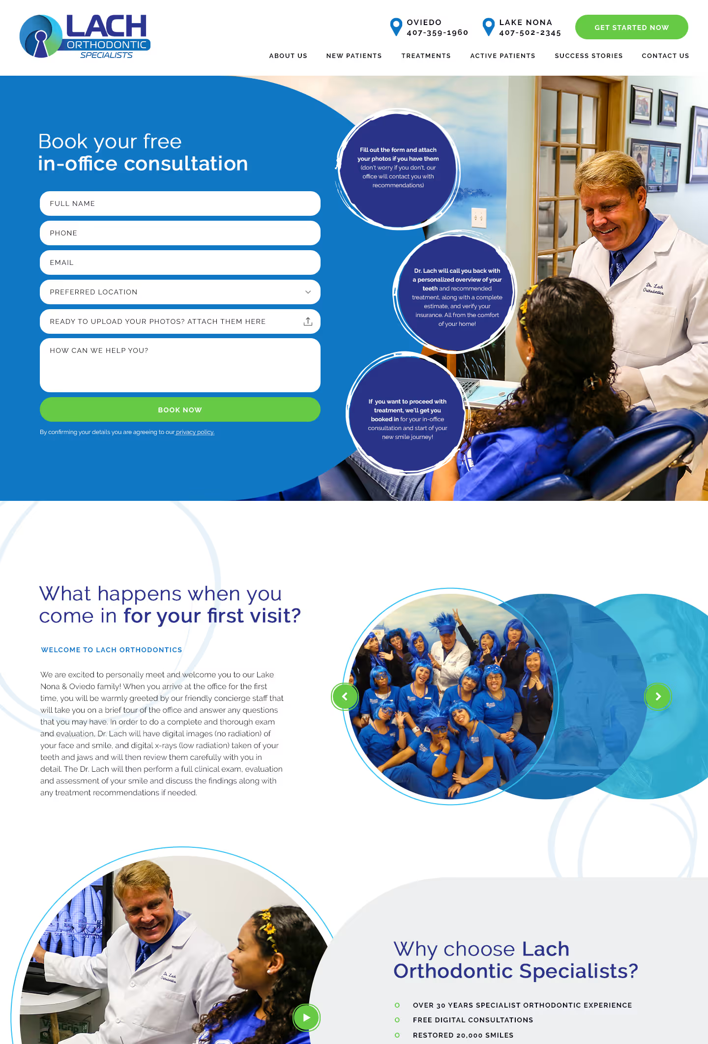
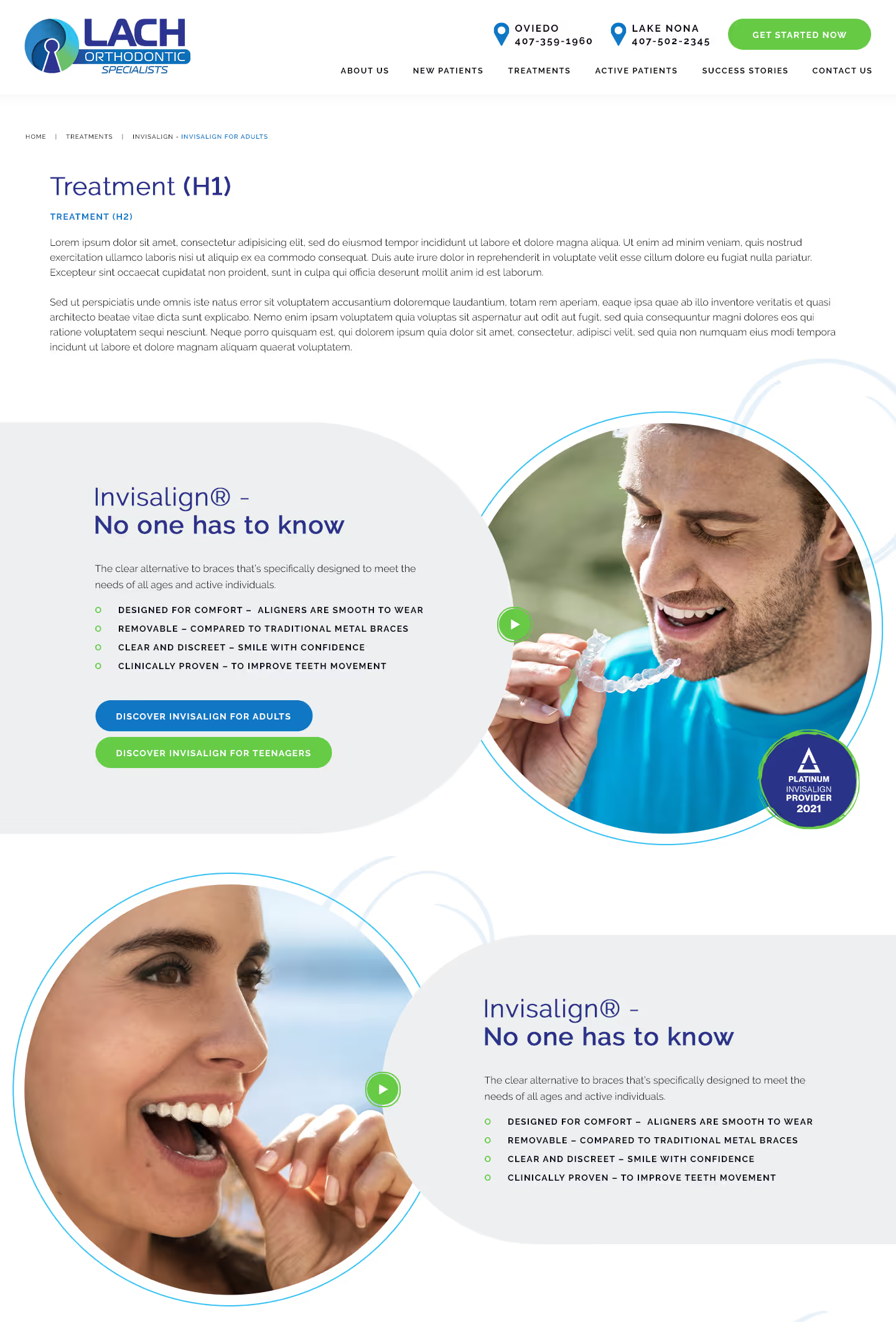
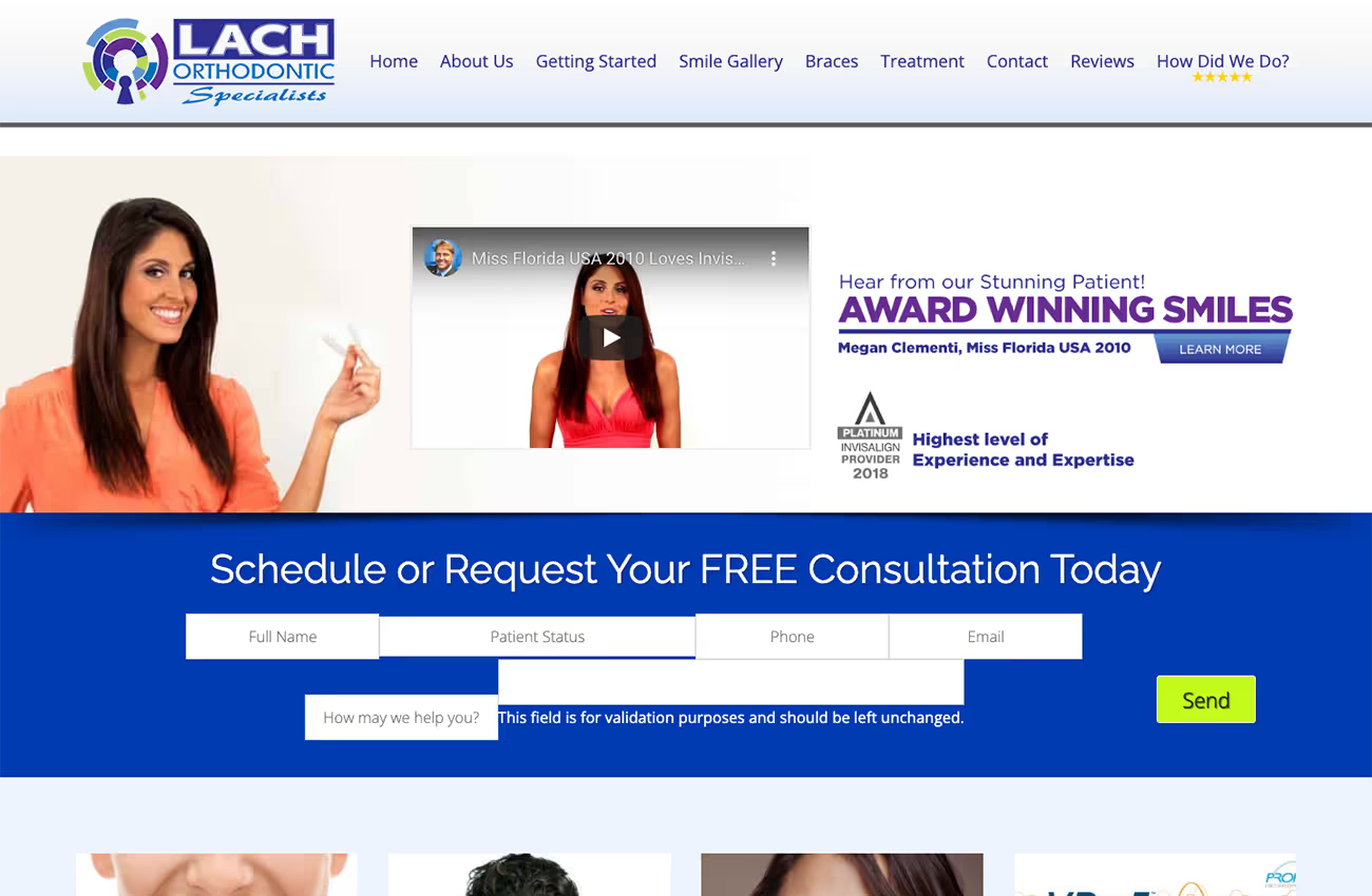
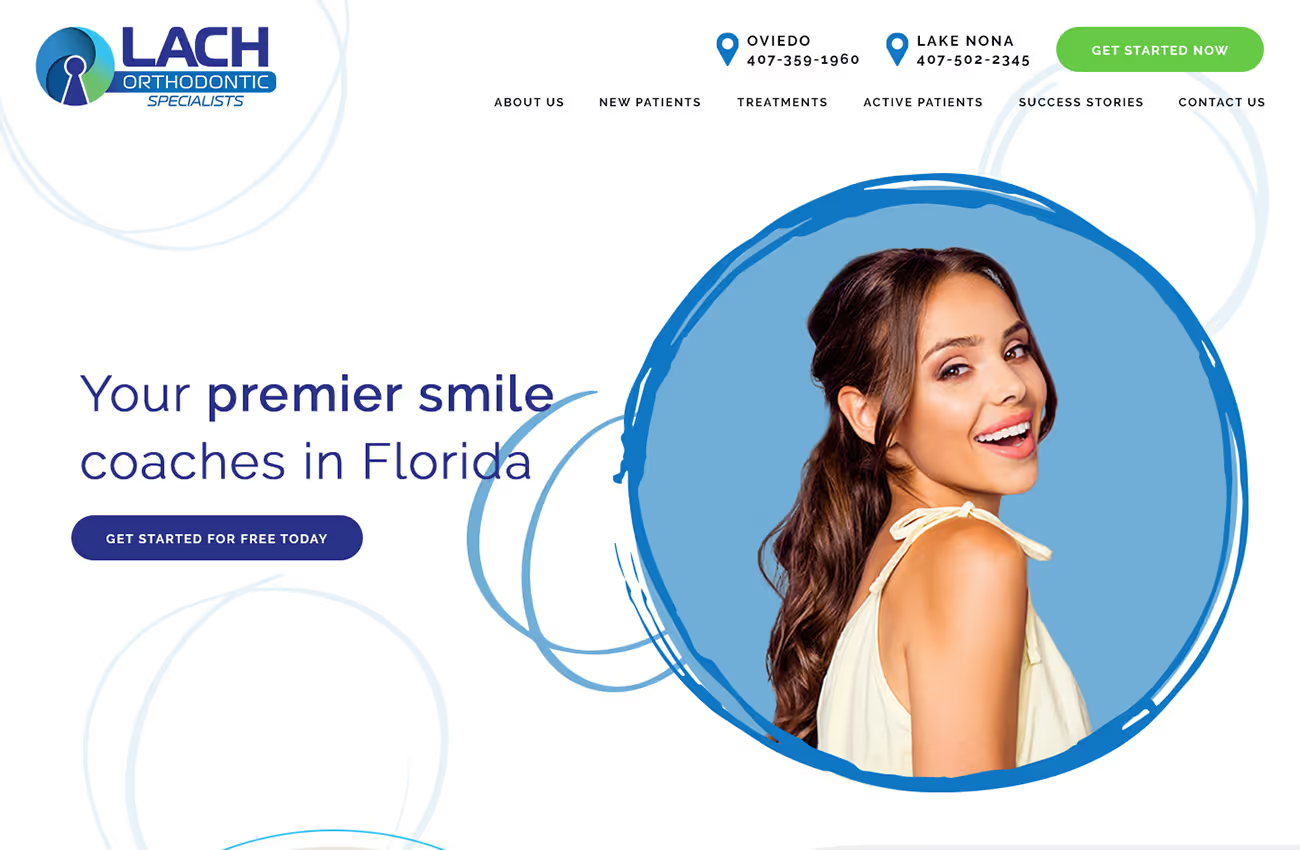
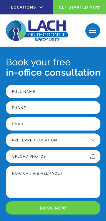
We were tasked with designing a new website for Lach Orthodontics to replace their current confusing one. The new site needed to be user-friendly, with clear navigation and a welcoming feel for new users. It also had to reflect their brand's energy and fun while prominently featuring a patient zone for returning clients. Inspiration was drawn from their logo.
Web design
Wireframes
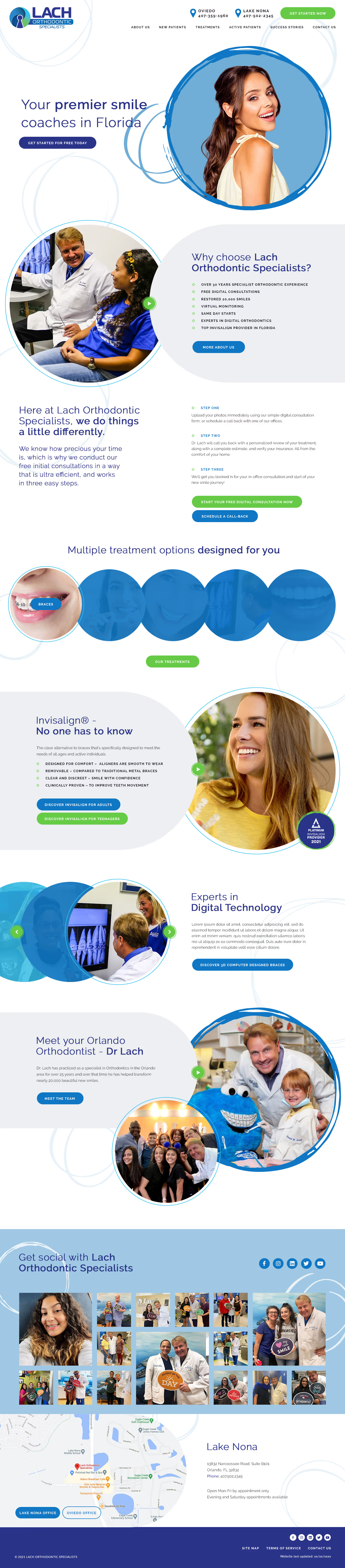

Our design uses angles and spirals from the logo for a cohesive look. We included edge-to-edge imagery from the practice to create a friendly vibe. The patient zone is highlighted in multiple areas for easy access. For sections like "Experts in Digital Technology," we used interactive elements to engage users. The colour palette is based on their logo, with shades of blue, green, and a touch of purple. We chose a clean and modern font for its appearance, aiming for a site that is both energetic and functional.


Barncroft, Abberton Road, Bishampton, Worcestershire, WR10 2LU.


