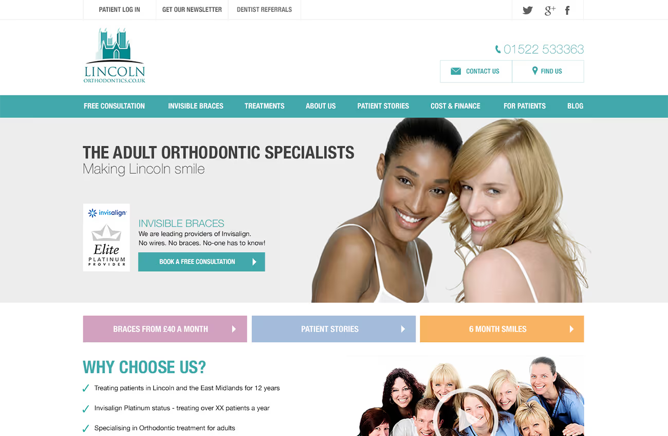
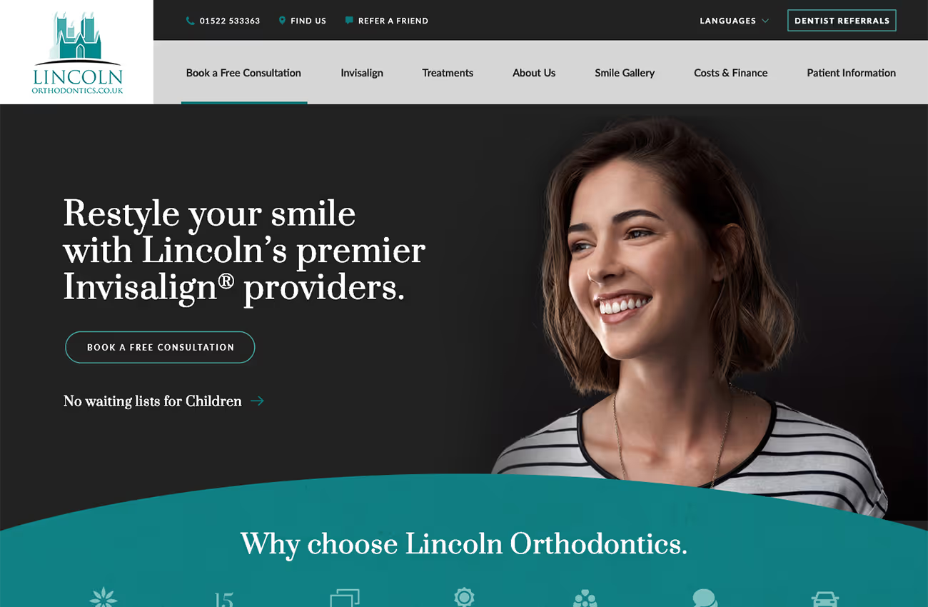
We were tasked with redesigning the Lincoln Orthodontics website, inspired by their existing brand identity and incorporating elements from a theme the client favoured. The aim was to create a sophisticated, streamlined look by condensing the colour palette to grey, white, and teal. We also aimed to draw design inspiration from the logo, particularly the arch associated with the Lincoln Cathedral.
Web design
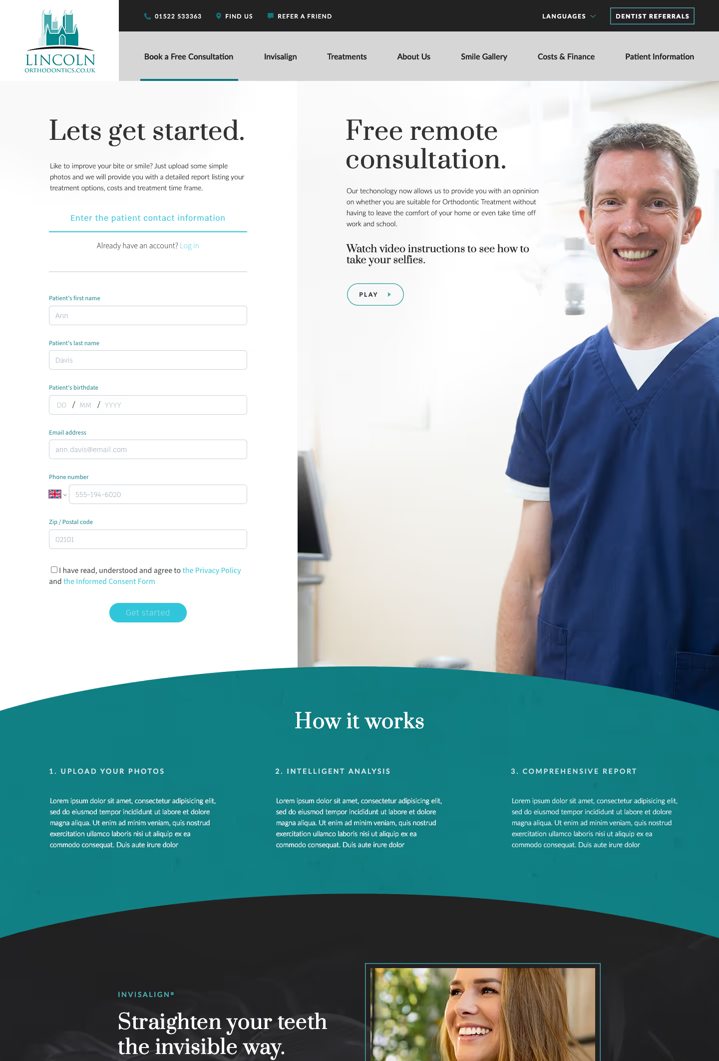
Wireframes
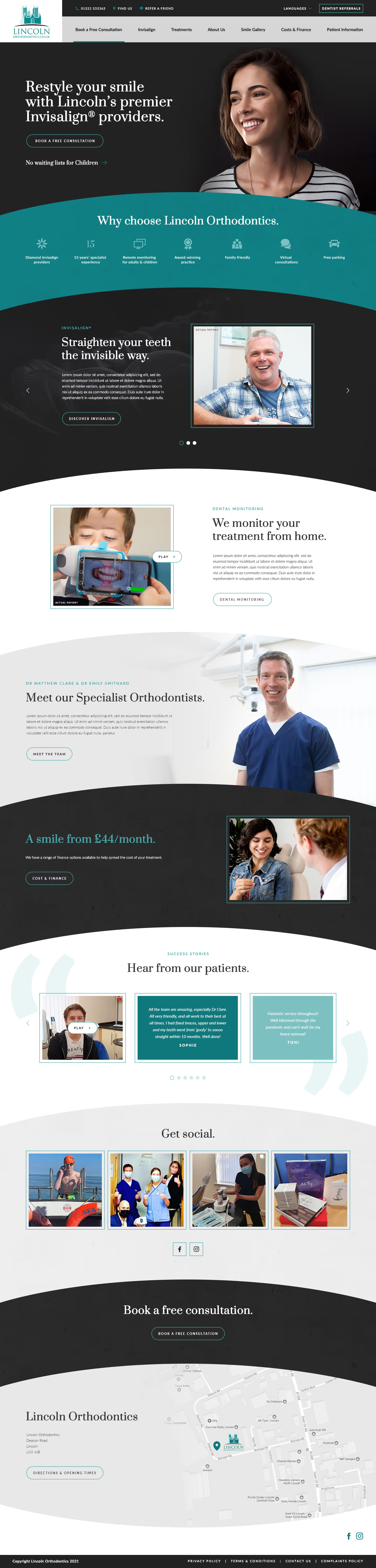
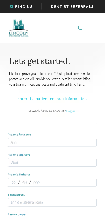
Our final design integrates these elements, using the cathedral arch for container designs and adding texture for depth. The Invisalign section is streamlined with a carousel for easy navigation. Image boxes with green strokes highlight photos, and full background images subtly blend with the text. We chose a stylish serif typeface for titles, complementing the modern and stylish feel, and a versatile sans-serif typeface for body text, ensuring readability and emphasis on key information.


Barncroft, Abberton Road, Bishampton, Worcestershire, WR10 2LU.


