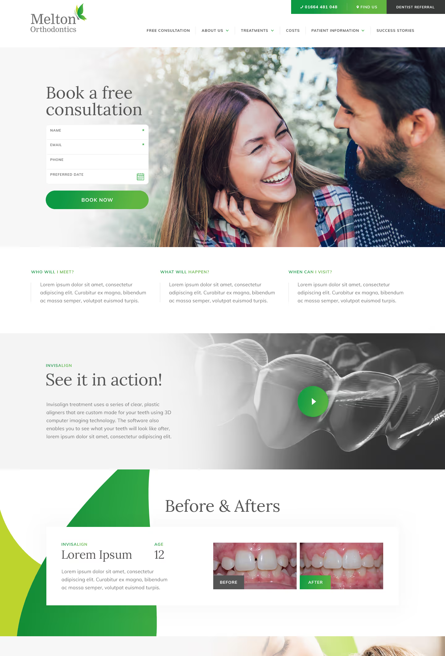
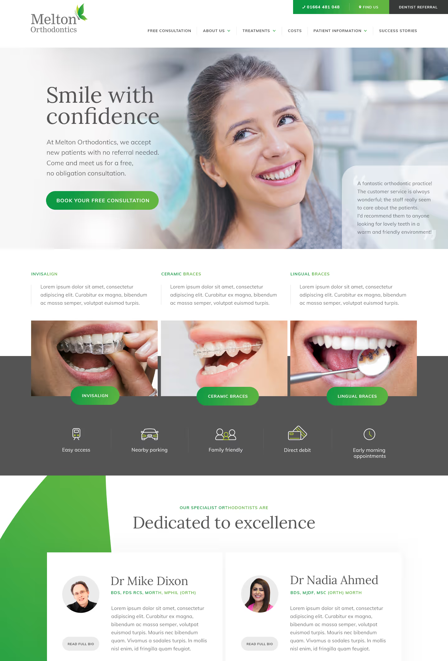
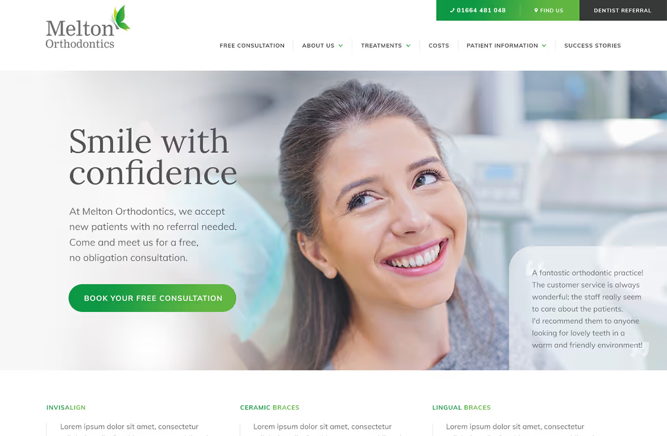
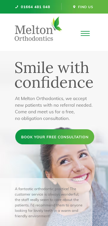
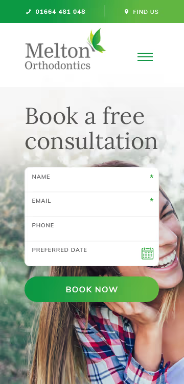
Melton Orthodontics requested a website that reflects a modern and welcoming feel, suitable for both adults and children. They wanted the site to use their logo's green and grey colours for a cohesive look and to highlight key areas. The design should be clean and uncluttered, with lots of white space, and feature professional yet friendly fonts. The goal is to convey a sense of trustworthiness and professionalism while being approachable and family-friendly.
Web design
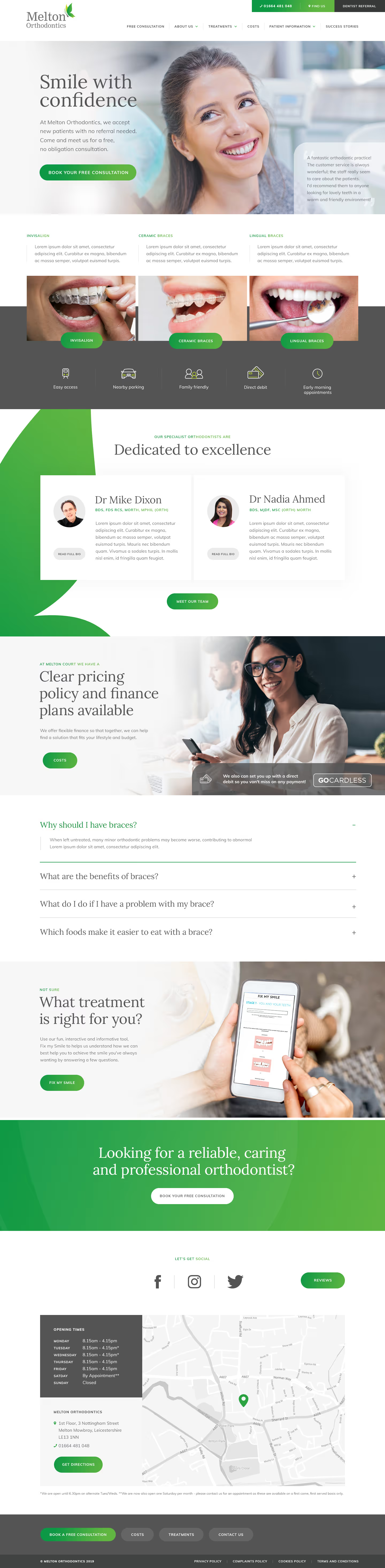

We developed a website with a minimalist colour palette of green and grey to highlight key sections and calls to action. The design uses the logo’s butterfly shape for subtle branding elements. The fonts chosen, Lora and Muli, offer elegance and legibility. Interactions are designed to be subtle, with colour changes and smooth fade-ins, ensuring the user experience is engaging without being distracting.


Barncroft, Abberton Road, Bishampton, Worcestershire, WR10 2LU.


