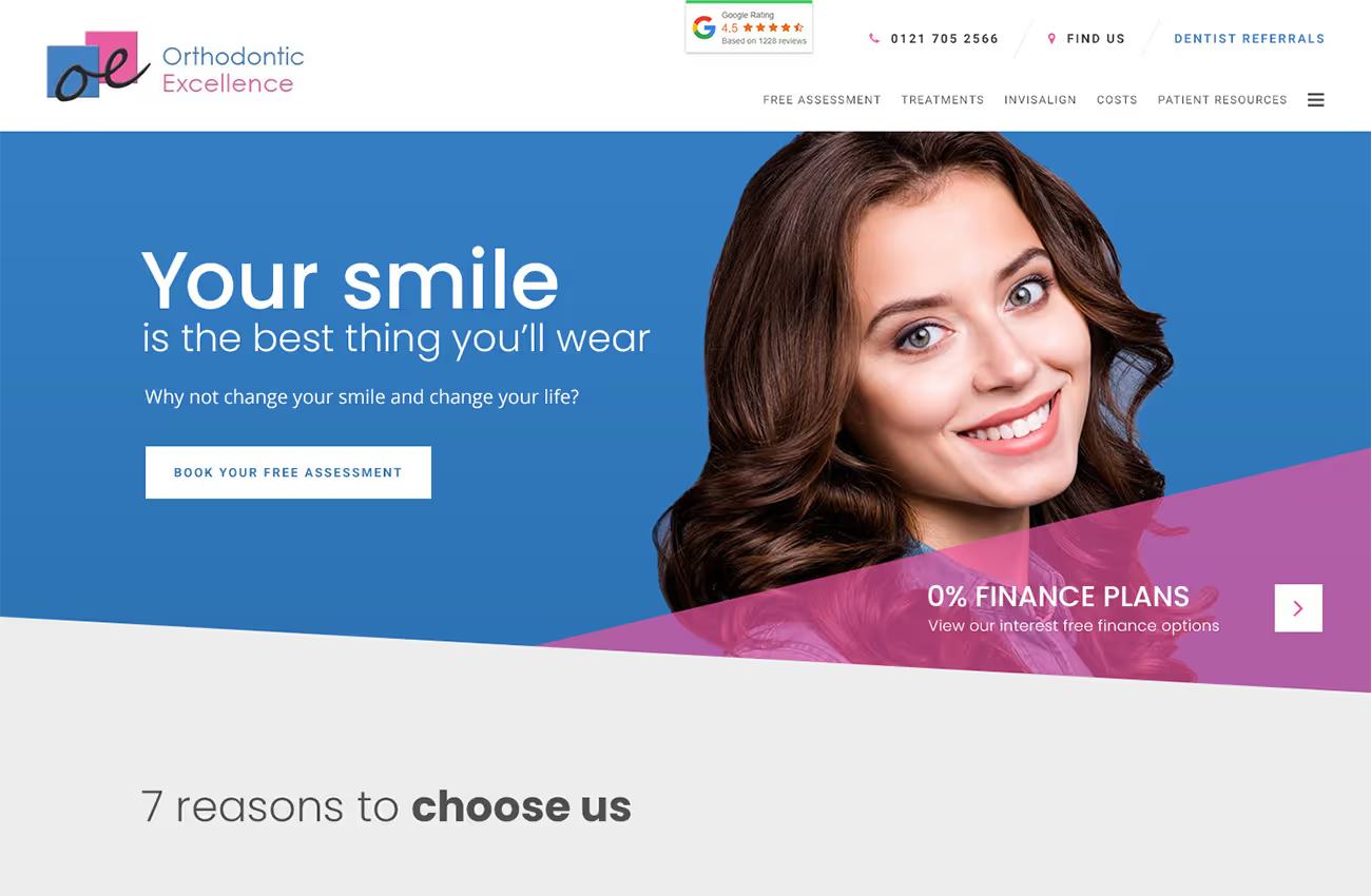
The client wanted a fun, friendly, and fresh website design that moved away from traditional square shapes. They requested a unique look using angular containers, a limited colour palette of blue, pink, and white for a contemporary feel, and an adaptable navigation menu. The design needed to appeal to adults and teens, enhancing the practice's approachability and professionalism.
Web design
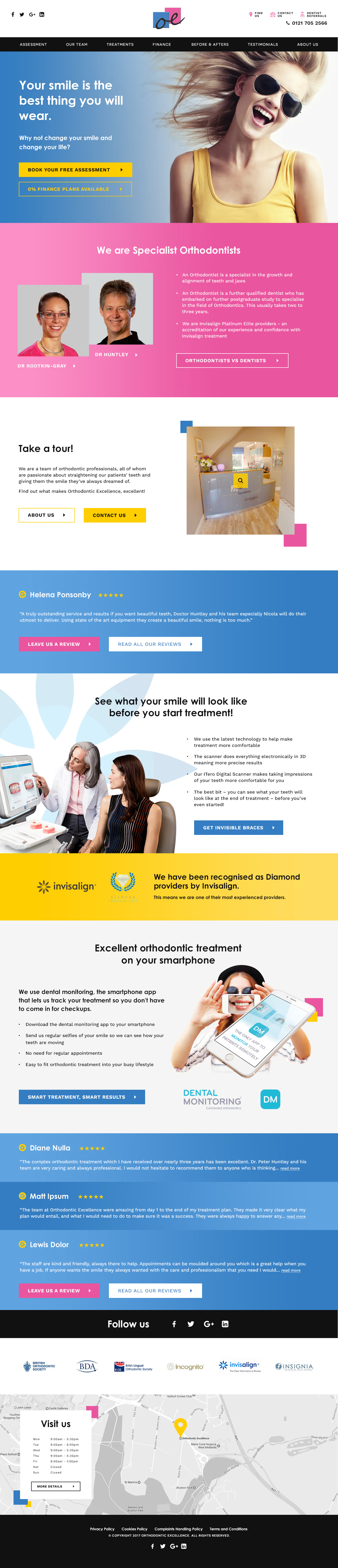
Wireframes
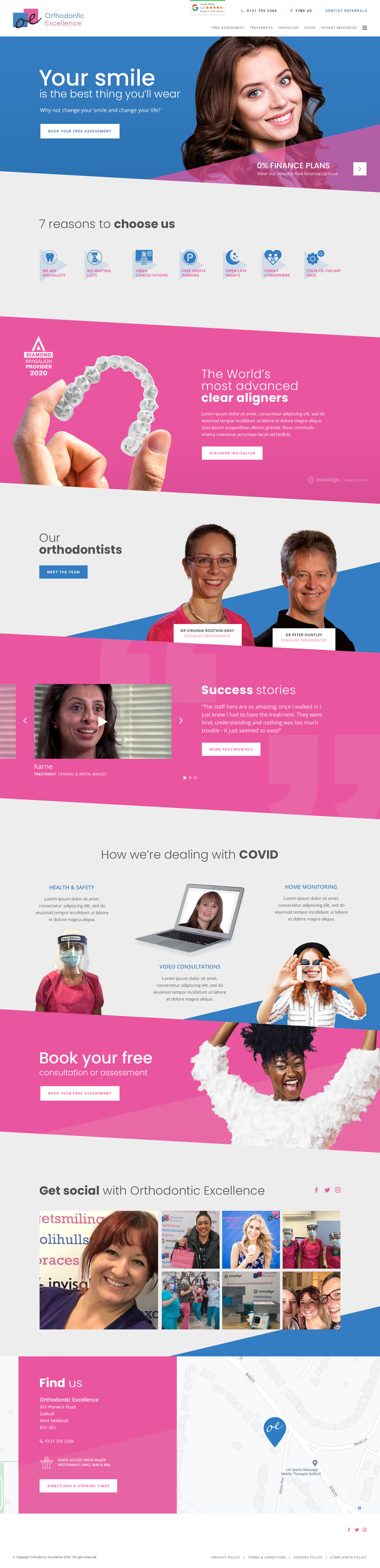
Our solution features angled sections and bold colours to guide the viewer's eye and encourage scrolling. We used the client's imagery to personalise the site, supplemented with stock images for a genuine feel. The navigation menu is flexible, and the use of contemporary fonts ensures readability across devices. This design creates a punchy, unique aesthetic that appeals to the target demographics and enhances the practice's approachable, professional image.


Barncroft, Abberton Road, Bishampton, Worcestershire, WR10 2LU.


