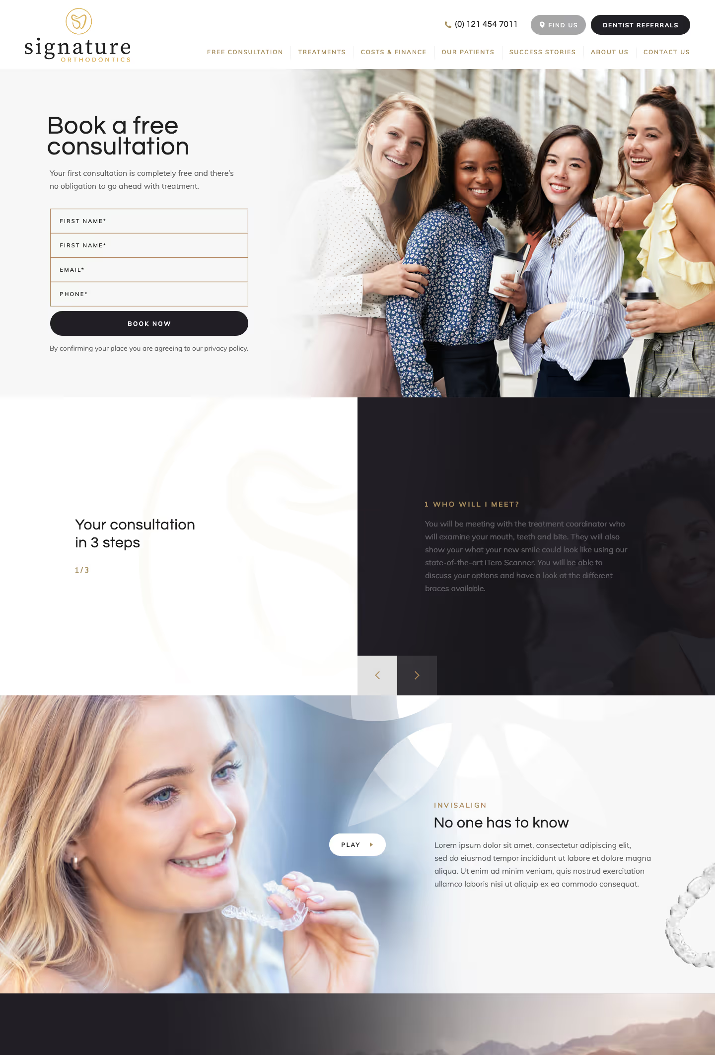
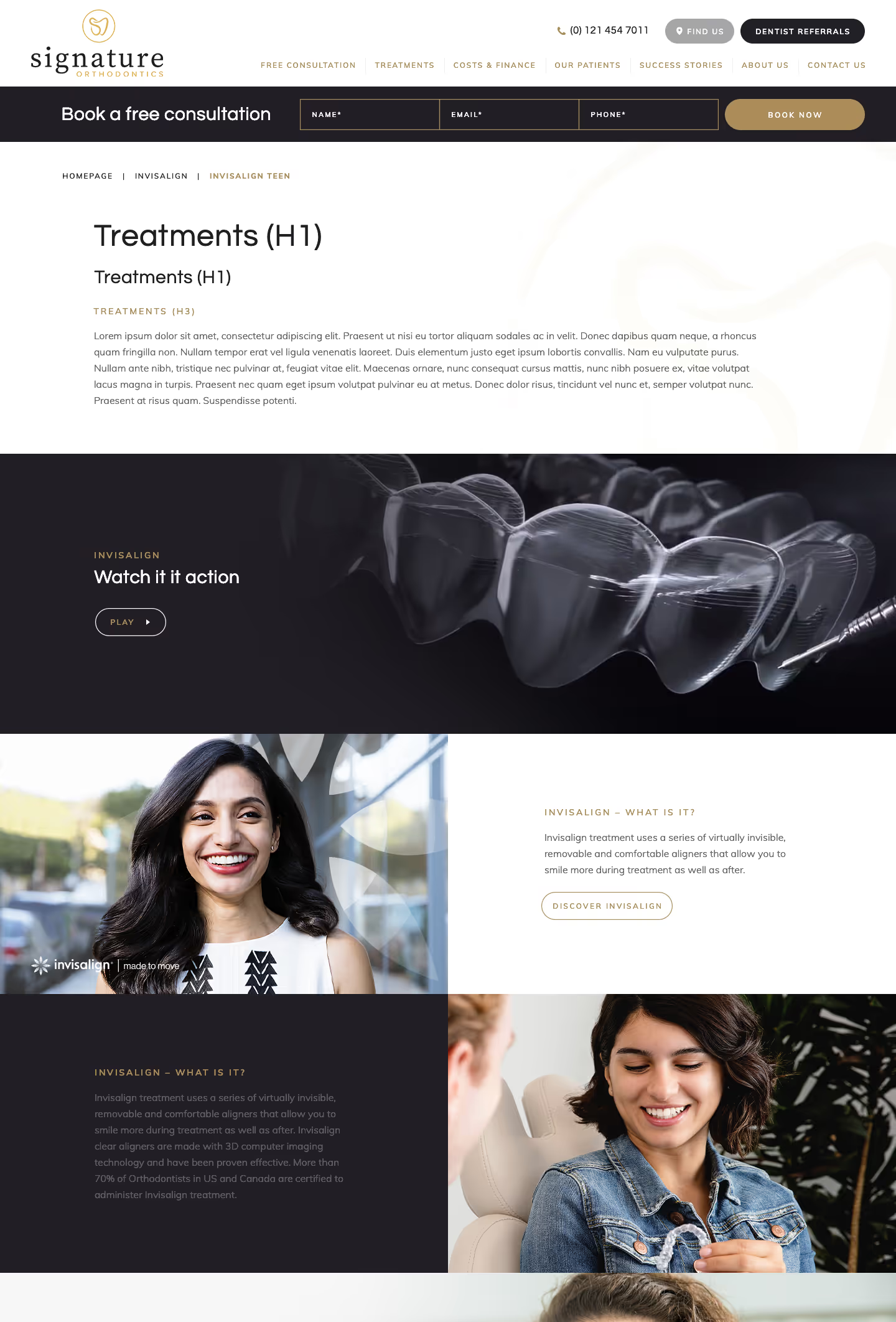
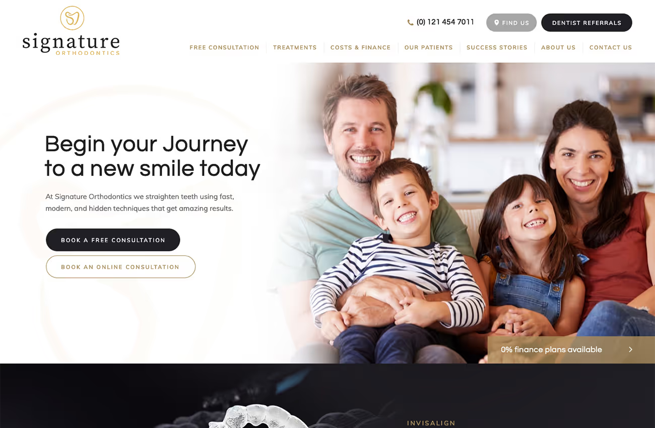
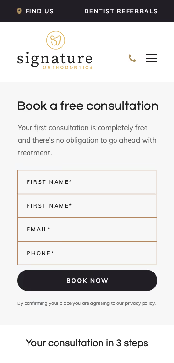
Our brief was to create a clean, minimal, and modern website for Signature Orthodontics, inspired by professional and contemporary designs. The client requested to move away from pink branding, opting instead for a gold, white, and black colour palette. Our goal was to achieve a balance of colours, using gold for CTAs and subheadings, and an off-black as minimal page dividers to create contrast and section breaks.
Logo design
Web design
Wireframes
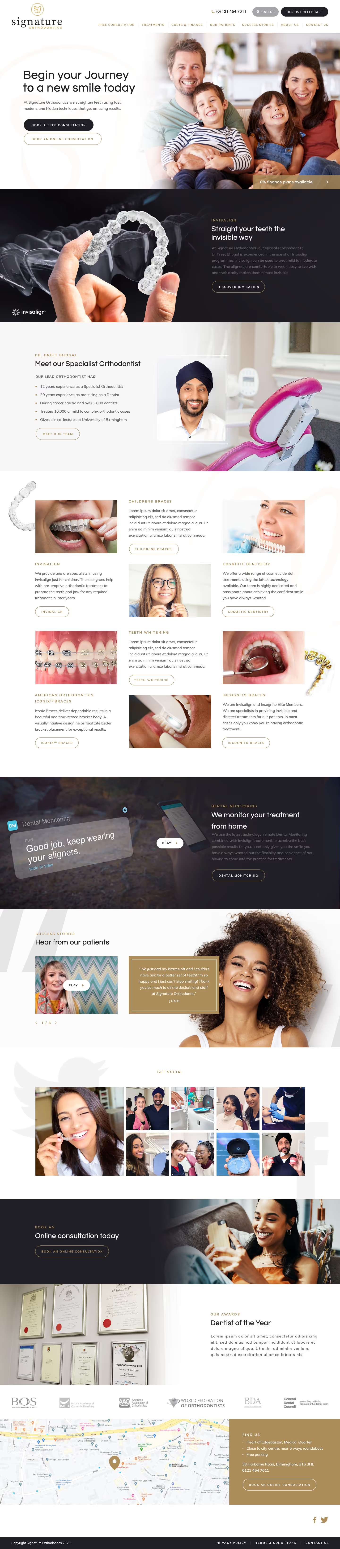


In our solution, we ensured the website had a light, elegant feel with subtle, sophisticated interactions. CTAs were designed to transition smoothly from a simple line to a filled box upon hover. We used modern fonts to improve loading times and maintain a clean look. Additionally, we included a pop-up function on the "Meet the Team" page for a clean, informative presentation.


Signature Orthodontics required a logo that reflected professionalism with a friendly touch. The design used a brush-style icon incorporating the letters "S" and "O" in the shape of a tooth, symbolising the orthodontic field. A friendly serif typeface was chosen to create approachability, and contrasting weight and colours between the top and bottom words were employed to highlight clarity and distinction.


Barncroft, Abberton Road, Bishampton, Worcestershire, WR10 2LU.


