Star Orthodontics requested a logo that would reflect a modern and approachable aesthetic while maintaining a professional appearance. They wanted a design that would be both eye-catching and easy to read, appealing to a wide audience. The logo needed to balance a sense of warmth and friendliness with the trustworthiness expected from a medical practice, particularly one focused on orthodontic care.
Logo design

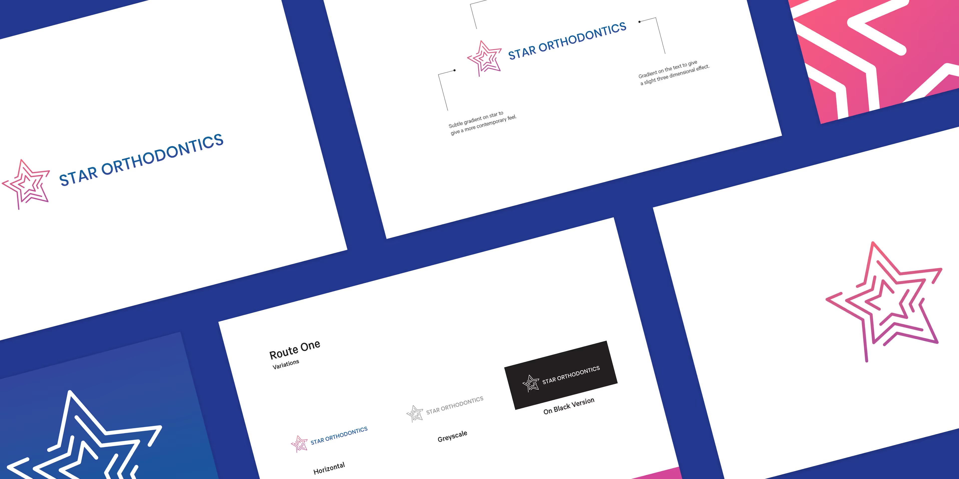
To achieve this, a subtle gradient was applied to the star symbol, giving it a contemporary and dynamic feel. The text was kept in a solid colour to provide a clear contrast with the gradient, ensuring strong readability and professionalism. This combination of elements creates a balanced, modern look that is both welcoming and trustworthy, aligning perfectly with the values and goals of the practice.


Barncroft, Abberton Road, Bishampton, Worcestershire, WR10 2LU.


