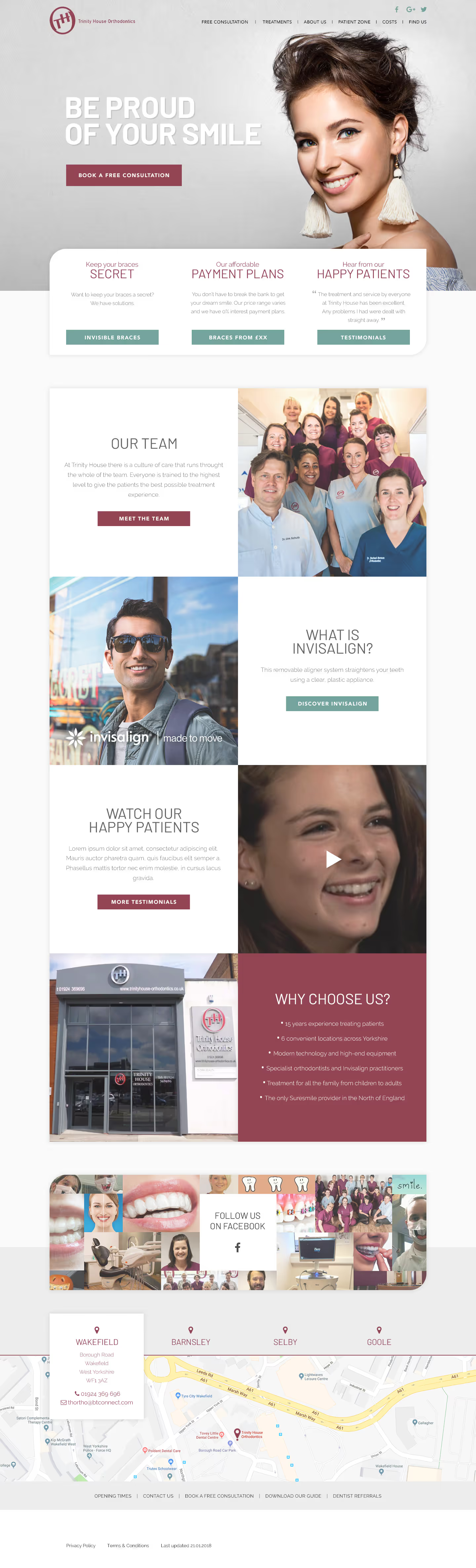
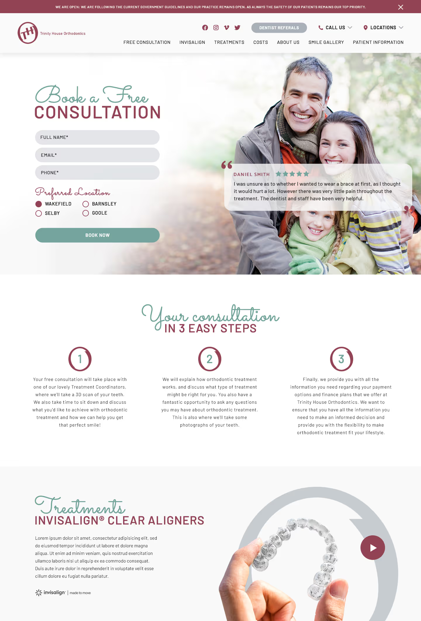
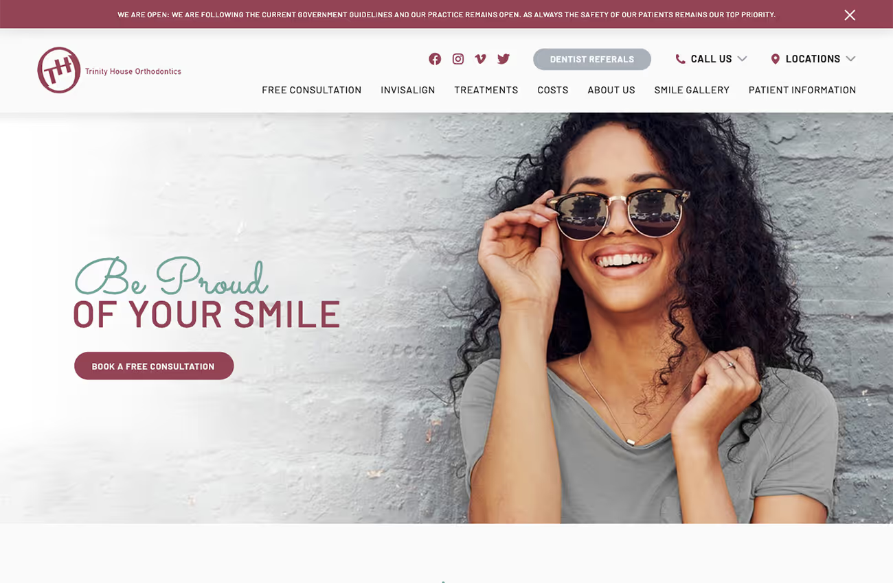
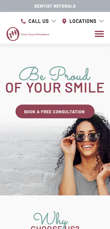
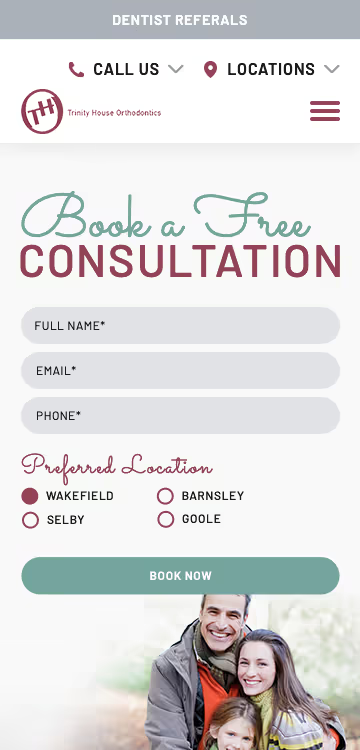
We were tasked with redesigning the Trinity House Orthodontics website to reflect their strong existing brand identity while bringing a more contemporary feel. The brief highlighted the importance of evolving the current colours and integrating a script font to enhance warmth and friendliness. We focused on balancing rounded elements through icons and sections to maintain a cohesive look without overloading the design.
Web design
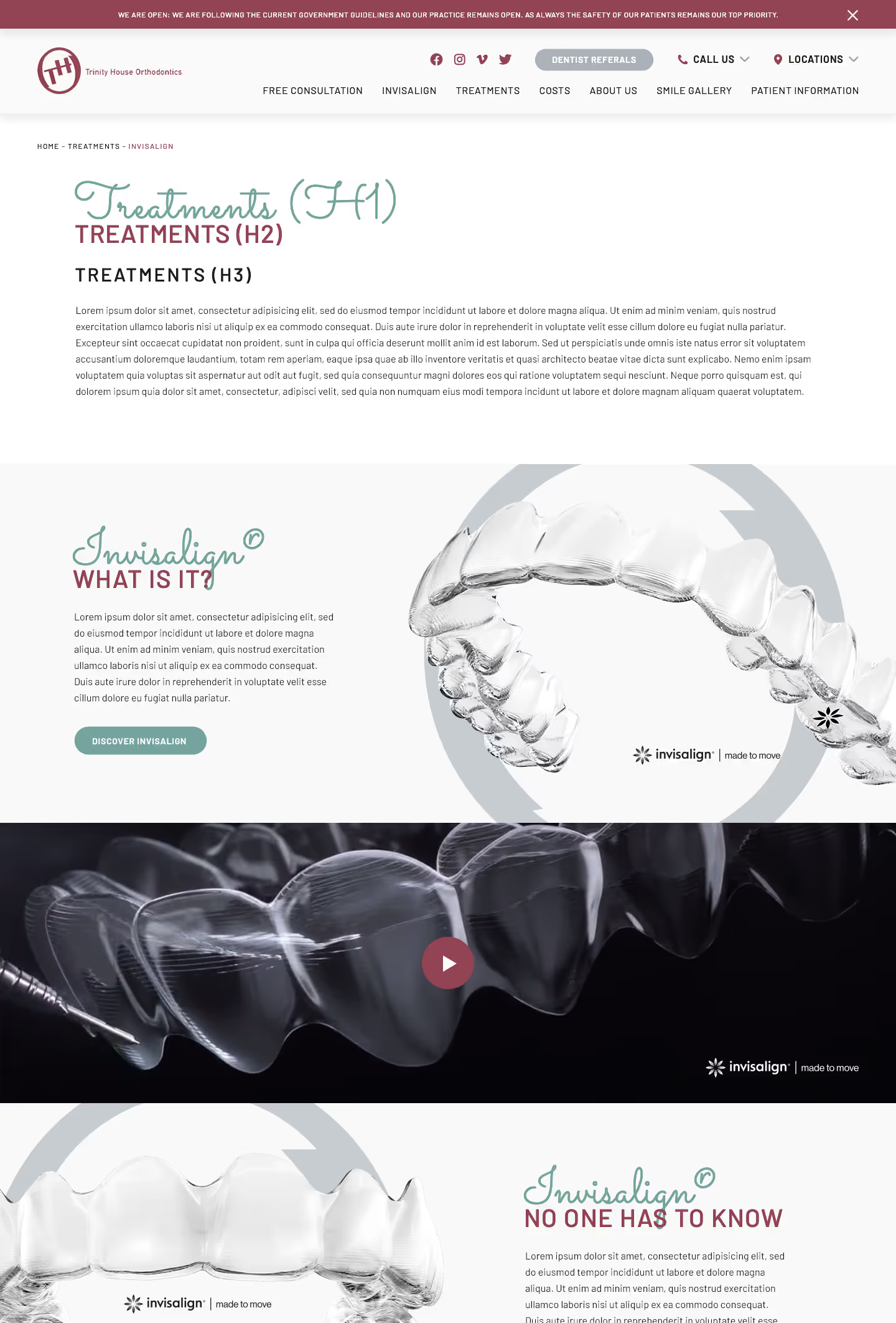
Wireframes
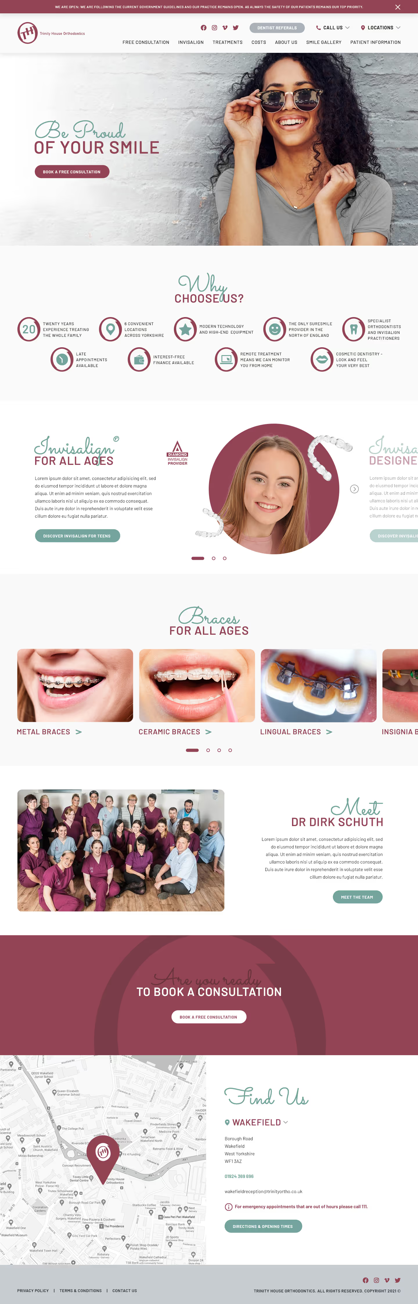
Our solution features an updated, user-friendly navigation with dropdowns for easy access to contact details and locations. The "Why Choose Us" section includes subtle interactions to guide users through the content smoothly. We added slight parallax movements to the Invisalign braces and used handwritten arrows to complement the script font, achieving a warm and welcoming aesthetic that aligns with the team's friendly image.


Barncroft, Abberton Road, Bishampton, Worcestershire, WR10 2LU.


