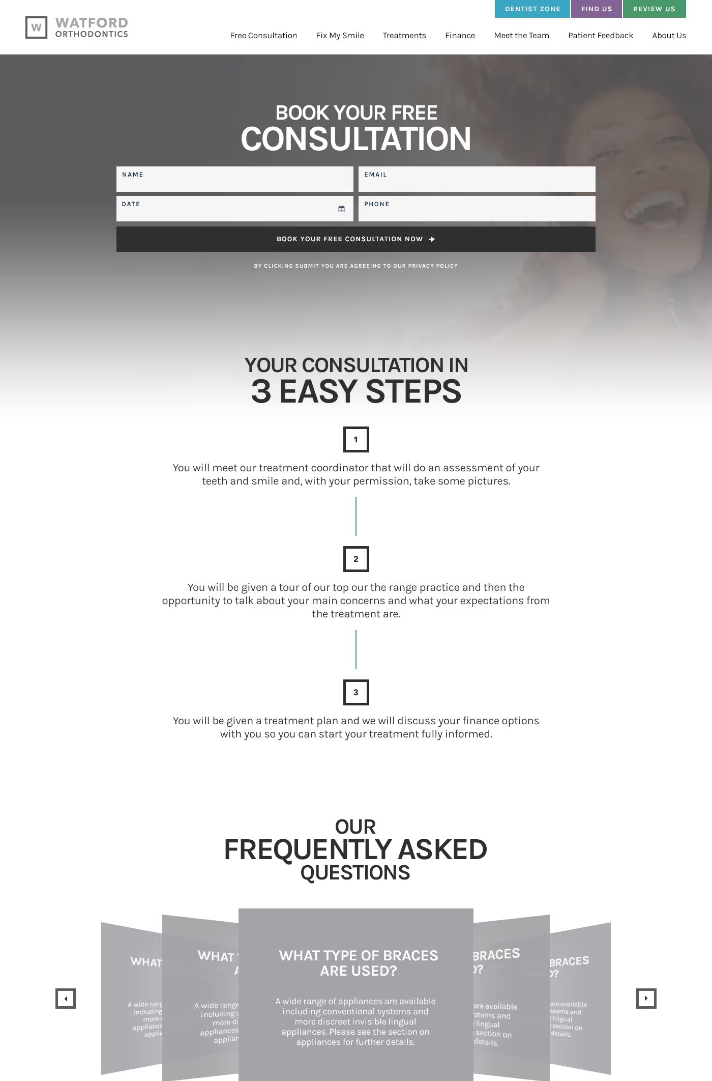
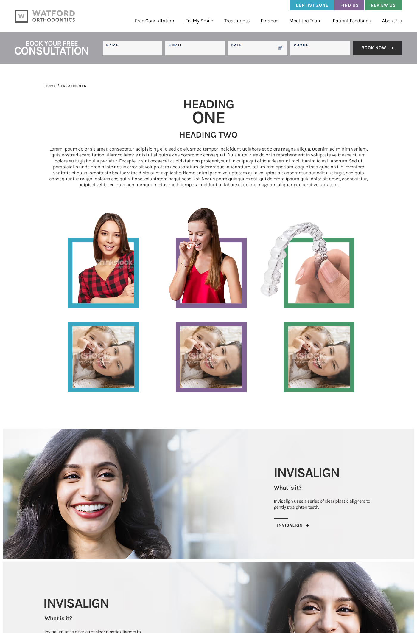
Watford Orthodontics requested a modern, user-friendly website to promote their orthodontic services. The objective was to highlight key offerings, such as Invisalign and advanced technology, and to ensure easy navigation for users seeking information on treatments, payment plans, and consultations. The site needed to be welcoming to both adults and children, emphasising a family-friendly environment.
Logo design
Web design
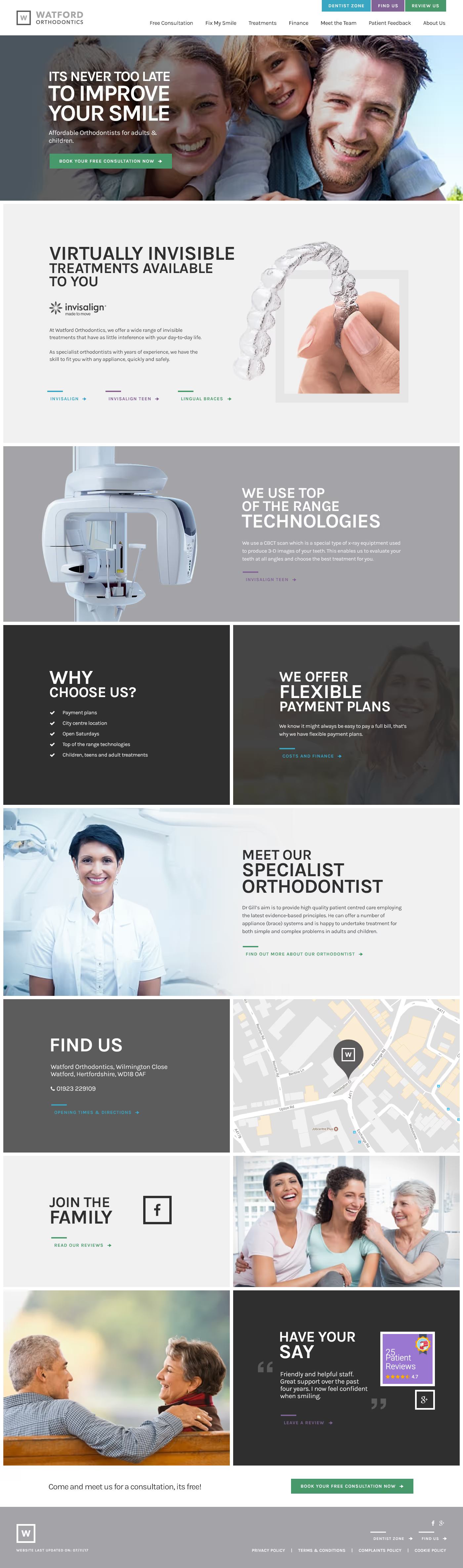

The website was designed with a clean, professional look, featuring high-quality images and clear calls to action. Key services are prominently displayed, along with patient testimonials and an easy-to-use map for location details. The site’s layout ensures visitors can quickly find information on treatments, meet the team, and book free consultations, creating an inviting and efficient user experience.
My Watford Orthodontics needed a modern, professional logo that was both simple and timeless. The design uses a clean sans-serif font, with contrasting text weights for "Watford" and "Orthodontics" to create emphasis. A minimalist "W" icon adds recognisability, while the greyscale colour options ensure a sleek and versatile appearance suitable for different applications.


Barncroft, Abberton Road, Bishampton, Worcestershire, WR10 2LU.


