We were tasked with creating a website that visually represents Wu Orthodontics' brand identity. The key requirements were to incorporate their blocky aesthetic, use a specific colour palette, highlight their technological advancements, and ensure the design is responsive and user-friendly.
Web design
Wireframes
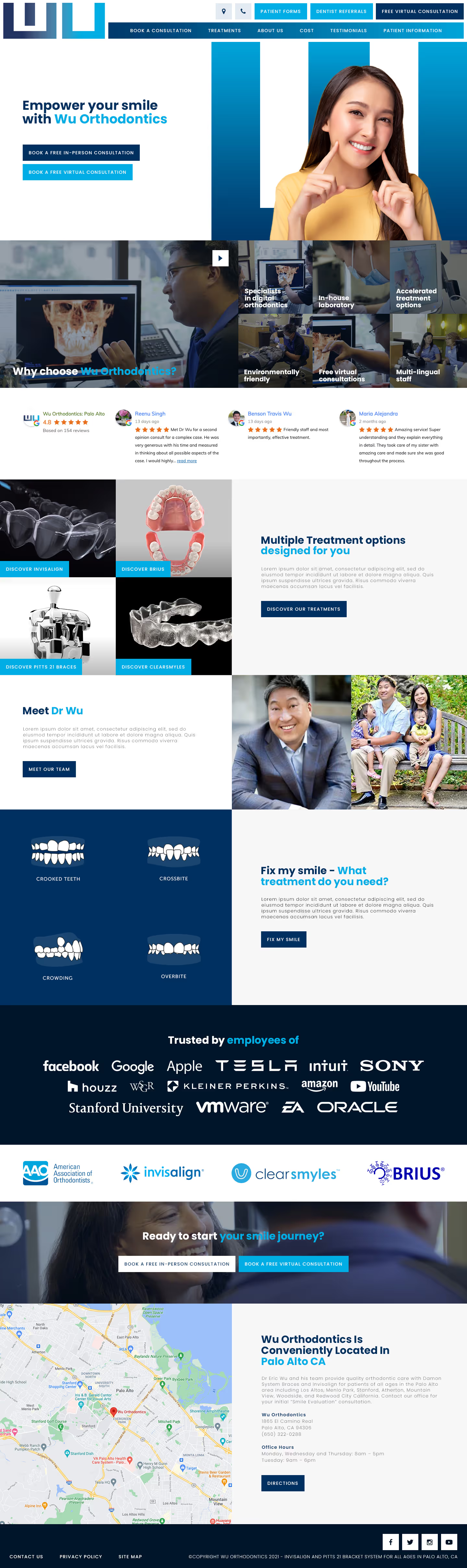

We crafted a design featuring bold, blocky elements and a cohesive colour scheme of navy and light blues. The hero section showcases a "W" inspired by the logo to strengthen brand identity. The imagery emphasises their advanced technology, positioning Wu Orthodontics as a modern, cutting-edge practice. The layout is designed for optimal responsiveness and an enhanced user experience.


Barncroft, Abberton Road, Bishampton, Worcestershire, WR10 2LU.


