Zen Orthodontics requested a logo that embodied the values of calm, balance, and professionalism, which are core to their approach to orthodontic care. They wanted the design to convey a sense of harmony and trust, ensuring that patients feel at ease when visiting the practice. The logo also needed to reflect precision, aligning with the technical expertise involved in orthodontics, while maintaining a welcoming, natural aesthetic.
Logo design

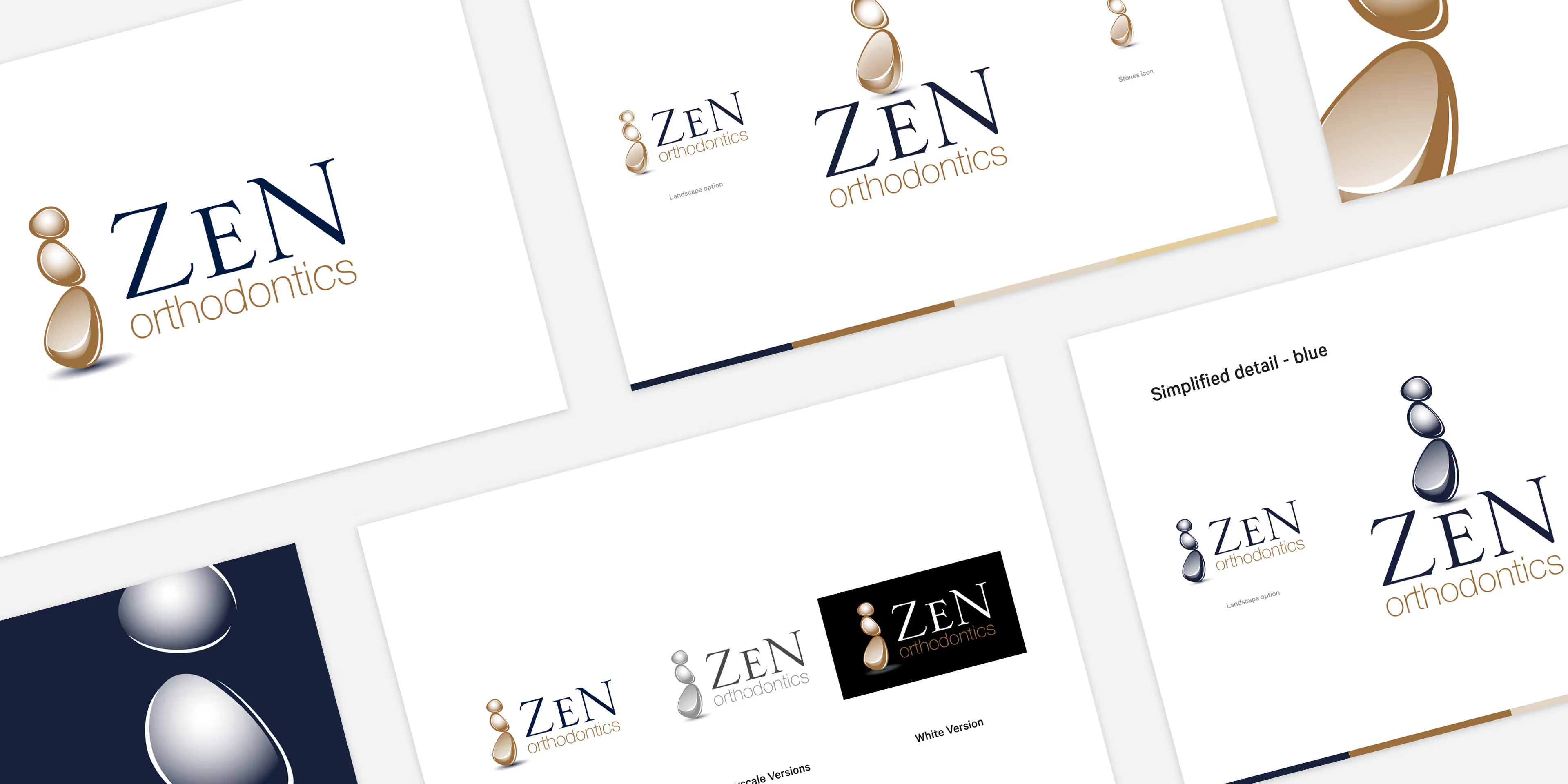
The solution was a design featuring a stack of smooth, rounded stones, symbolising balance and calm. This natural element communicates the brand’s patient-centred and gentle approach. The modern, clean typography was chosen to highlight professionalism and reliability, while the soft, neutral colour palette adds to the calming and welcoming feel. Together, these elements create a logo that reflects Zen Orthodontics' commitment to precision, care, and patient comfort.
.svg)


Barncroft, Abberton Road, Bishampton, Worcestershire, WR10 2LU.


